When i
was young, the beauty of church always belonged to other people: the believers.
They saw the same stained glass I saw, but when its jeweled light cut their
skin into kaleidoscopic colors, they somehow belonged in that light in a way I
never would. They could feel the lilt and soar of the hymns as truth, as
collective yearning, as a tin-can telephone connecting them to God. That’s what
I told myself. I told myself I was alien to that beauty—I’d never be anything
but an interloper lurking just outside its grace.
Some
version of that girl I’d been in church—with legs too long for her denim
overalls, and palms covered with half-moon crescents where she’d dug her nails
into her skin—was summoned for a different rapture, years later, by the
photography of Garry Winogrand. Some version of that girl was told: This is
beauty you belong in. The first time I entered the Brooklyn Museum’s 2019
exhibit of his color photography, part of its force was this immediate sense of
invitation, as if a door had been carved in a wall, leading to some new world,
and now I could cross into it—or perhaps simply see more clearly that I’d been
living in that miraculous world all along. It had only disguised itself as
something familiar, or banal.
Even the
physical structure of the exhibit contributed to this sense of
invitation—induction into some holy ordinary realm, hidden in plain sight. At
the entrance, you had to part a thick black-velvet curtain to step into a long
gallery that was as cool and dark as a cinema, with huge color slides projected
on the walls: a dark-haired teenage girl in a white bathing suit silhouetted
against a bright-blue sky. A little boy in tiny shorts putting his coins into a
vending machine to buy a Coke. Old ladies in folding chairs on the sand,
playing cards. A woman propped on her elbows on her beach towel, a messy mickey
stick-and-poke tattoo on her arm, cat’s-eye sunglasses hiding her mood. A man
lying on his back, with his blue-canvas sneakers tucked beside him and the
sunlight pouring across his body, the cigar in his mouth pointed straight up
toward the sky. These photographs seemed born of a gaze that regarded strangers
with faith—in their beauty, in their humanity, in their radiance—and suggested
a radical innocence, almost transgressive, in an era when the country has often
felt divided past the point of repair, certainly past the point of goodwill.

Winogrand
was deeply drawn to public spaces—sidewalks, bus stops, airports, beaches,
motels, campgrounds, highways, boardwalks, carnivals, zoos, parking lots,
pools—and his photographs opened onto these restless, gritty infinitudes, often
landing on a single wistful or bewildered or determined individual amid the
larger crowd. The exhibit, steeped in the moods and fashions of the 1950s and
’60s, felt like time travel: women in chiffon scarves, men washing their
Mustangs, people dressed in their Sunday finest for the airport, or their
bathing caps for the beach. It was easy to follow these accents of the era into
nostalgia for another time—a time when daily attention to the glorious
undertones of the mundane had been possible, and justifiable. But of course
this unremarkable glory is still everywhere, all around us. It still lives in
precisely those in-between moments the photos captured, in all their
incandescent immediacy: people smoking alone on the sidewalk, or leaning their
head against another’s shoulder. People showing off, goofing off, getting off
flights. People reaching for each other on threadbare towels laid across the
scorching sand.
Years
prior, during my early attempts to get sober—when I was spending many evenings
each week in church basements—I’d fallen in love with a quote from the writer
and theologian G. K. Chesterton:
“”How much larger your life would be if
your self could become smaller in it; if you could really look at other men
with common curiosity and pleasure … You would break out of this tiny and
tawdry theatre in which your own little plot is always being played, and you
would find yourself under a freer sky, in a street full of splendid strangers.”
Now here
it was, this dark gallery with its windows of light: a freer sky, a larger
theater, a street full of splendid strangers. These slides were a tutorial in
the proximity of the sacred, how it was never far from us: a family having a
picnic against a backdrop of rolling white sand dunes; street clowns at a
parade beneath a sign advertising dallas’ finest hamburgers; flight attendants
in their powder-blue suits, clustered on an asphalt divider, shadowed by palm
trees and boxy, off-white airport hotels. These ordinary strangers literally
gave off light. It glowed across the faces of the ordinary strangers watching
them. The exhibit felt like a recovery meeting. It felt like going to church. I
couldn’t get enough of it.
After my
first visit, I kept coming back. I must have visited that exhibit at least 30
times. Mostly, I went with my baby; it was, among other things, a useful way to
pass the hours of our days. But I brought everyone I could. I wanted to be
there with my friends, my friends’ babies, my mother, my aunt, the ex I hadn’t
spoken with in years. I wanted to bring my grandmothers back from the dead, so
I could be there with them. It was a secular cathedral, a church of regular
life, this dark room lit by luminous slides. They lined the walls like
stained-glass windows, but instead of showing saints or biblical scenes or the
stations of the cross, they showed daily existence: two kids flipped upside
down on a handrail above a storm drain; a man in a striped shirt licking a cone
of vanilla soft serve, that moment of pleasure like a whittled point of
stillness inside the frenetic circus of Winogrand’s hustle and bustle.
These
were stunning scenes not because they were extraordinary, but because they
weren’t. They were full of ordinary people seen so clearly that they became
extraordinary in their beauty. “How do you make a photograph that’s more
beautiful than what was photographed?” Winogrand once asked. But I didn’t see
his photos that way. I didn’t think he was making the world more beautiful; I
thought he was excavating beauty that was already there. His alchemy didn’t
turn the world holy so much as it revealed that the world had been holy all
along—outside the doors of the museum, and inside them too, we were holy. That
was part of the grace of his work, how it suggested that anyone could be art,
that the people standing in that darkened room were no less radiant than the
people glowing on the walls in front of them.
Born in
the Bronx in 1928, Winogrand was a New Yorker at his core, though he also
described himself as a “student of America,” and often crisscrossed the country
on road trips, taking photographs of gas stations and rest stops and motel
pools and highways. He disliked the terms street photography and snapshot aesthetic,
but it’s not hard to see why people use these terms to characterize his photos,
which suggest immediacy and spontaneity, capturing fleeting moments of the
present tense in their frames. Winogrand initially studied painting at Columbia
University, but “found painting a slow, deliberate process that demanded lots
of patience,” as his friend Tod Papageorge put it. “He preferred to work in a
way [that] could convulsively seize what it described … Photography answered
his agitated sense of self.”
Looking
at Winogrand’s photographs of the open roads and beaches of America, its motels
and airports, and especially the crowded sidewalks of its most populous city, I
found myself thinking of Walt Whitman, who had roamed the streets of his
beloved island of Mannahatta a century earlier. Maybe Whitman found his own
answer to an “agitated sense of self” in his peculiarly radical vision of
expansiveness—his feeling of effusing into others, and feeling them effuse into
him, a faith both ecstatic and arrogant. Whitman certainly felt composed of
strangers. His 1860 poem “To a Stranger” addresses itself to them:
“Passing stranger! you do not know how
longingly I look upon you,
You must
be he I was seeking, or she I was seeking, (it comes to me as of a dream,)
I have
somewhere surely lived a life of joy with you …
You give
me the pleasure of your eyes, face, flesh, as we pass.”
Winogrand’s
photos are saturated by this fascination with strangers—this faith in the
strange rub of molecules between anonymous bodies, and the fantasies we spin
from the faces of others. If Winogrand considered himself a student of America,
then that Brooklyn gallery was a rhapsodic articulation of the curriculum he’d
been studying. It was organized into eight themed clusters, like textbook
lessons: “Coney Island,” “Early Color,” “In the Streets,” “Portraits and Still
Lifes,” “On the Road,” “Travel,” and, in the back, facing each other: “Women”
and “White Masculinity.” Though he was mainly known for his black-and-white
photographs, Winogrand produced more than 45,000 color slides during the ’50s
and ’60s—making slides was less expensive than making prints—and it feels
essential and deeply moving that the photos weren’t turned into prints for the
exhibit. As slides in rotation, more than 450 in total, they felt warmer and more
alive, more in motion.
“Sometimes
I feel like … the world is a place I bought a ticket to,” Winogrand once said.
“It’s a big show for me, as if it wouldn’t happen if I wasn’t there with a
camera.” Many of his photographs document the rapt or wary faces of people
absorbed by some pageantry or performance that is unseen, out of frame: a crowd
gathered in a bruised-blue dusk around a garbage can labeled clear lake, let’s
be neat, all pointing at something in the sky—fireworks? shooting star?—or four
women standing in front of a carnival lemonade stand, looking fascinated and
perhaps a little repulsed. We cannot see what they are looking at, only their
faces doing the looking. Winogrand was less interested in the spectacle itself,
and more interested in what happened to us when we beheld it. How it gathered
us. That gathering—in the shadows of the carnival booth, the asphalt parking
lot beneath the fireworks—was what he’d bought a ticket to: the show of our
wonder and discomfort, our yearning for enchantment.
When i
first stepped onto Winogrand’s street of splendid strangers, I’d been separated
from my husband for four months. I was fond of saying that I lived on Planet
Women. It felt as if all the men had been banished from my life, or at least
from my days. Perhaps that was part of why I often found myself sitting at the
far end of the Winogrand exhibit, my back turned on the section called “White
Masculinity,” hopelessly entranced instead by the women across from it, as if
these women were a refuge, a solace, a womb: a woman with a bouffant on a bar
stool, sitting between a slot machine and what appears to be a Jack and Coke;
another one solo at a grimy diner table, hunched over a plate of eggs and
toast. Something in me reached toward the woman smoking alone in her
convertible, with the sun setting behind her and the wind whipping her hair.
She made solitude look liberating, while others made it look like a grind; I
knew the truth everyone knows, which is that it’s both.

Looking
at those women, I kept thinking of something my friend Jake had written about
walking up and down First Avenue in the weeks after his best friend’s death:
“On the streets of New York the trances of strangers’ lives were written on their
faces. I felt like I was everyone’s mother, and that everyone was mine.” I kept
thinking: These women are all my mothers. Maybe that sounds absurd or
melodramatic, but something about the cool, dark room stirred these wild surges
of emotion. Its luminous panels opened my nerves to the unknowable inner lives
of people I would never meet, and its shadows obscured the embarrassing
sentiment displayed across my features whenever I projected too much onto the
projections of their fleeing bodies.
If
Winogrand was a devoted chronicler of public spaces, then during the many hours
I spent in that shadowy hall—close to the sweat of strangers, to their morning
breath, to their invisible daydreams, their untold anguish, their ordinary
restlessness—I felt the exhibit itself becoming another kind of public space,
our bodies assembled in that room, giving one another our eyes, our faces, our
flesh. We were an iteration of the gatherings illuminated on the slides around
us: the cluster of folks sunbathing by the pool of the Tally Ho Motel, or the
ad hoc community pooling in the shadows under the Coney Island boardwalk—a mom
with her toddler sleeping on her lap; a shirtless man doing pull-ups on the
wooden rafters, someone else’s laundry hanging behind him. Or the three women
in bathing caps and bloomers standing in the surf, facing away from the camera,
gazing at the swimmers farther out, beholding that revelry and yet not fully
immersed in it. Those of us in the gallery found ourselves in some version of
that purgatory as well—at once drawn in and kept on the fringes. As Whitman
once wrote: “Both in and out of the game and watching and wondering at it.”
Since my
separation, I’d been seeking solace in public places—had spent pockets of that
aching winter in the Russian baths tucked behind Coney Island high-rises and
the ones in an old tenement basement on Tenth Street. Placing my body in those
unbearably hot rooms alongside the bodies of other people whose names I’d never
know was a way to remember heat during that long, frigid season. In the spring
I took my baby on long walks around Prospect Park, past the smoking charcoal
bricks and sizzling hamburgers of strangers, as she rode like royalty in her
stained and fraying baby carrier, close to my heart. When we got home and I
lifted her back onto the floor—where she could actually stand, breaking my
heart and remaking it—the dampness of her back and the dampness of my chest
were matching continents of sweat. The residue of our bodies in proximity was a
faint echo of the months when there had been no skin between us at all.
On the
subway that summer, I found myself leaking tenderness toward the unknowable
strangers sitting across from me, playing Candy Crush on their cellphones and
picking up their kids’ dropped Popsicles. Someone in a church basement quoted
Plato: “Be kind, for everyone you meet is fighting a hard battle,” which was
not actually something Plato said. It was something a 19th-century Scottish
minister said, but the urge to make the sentiment ancient or immutable made me
love it even more. In any case, it seemed suddenly clear to me that everyone on
the Q train during rush hour was fighting a hard battle, and so was everyone in
the unbearable heat of underground saunas, and I wanted to tell each and every
one of them, I know you are fighting! And you! And you! Instead I took myself
to Winogrand, over and over again. His photographs were daydreams. Or rather,
they were a technology for daydreaming. They were spurs to spin stories about
the lives of the people he’d preserved in their frames: three men carrying a
rolled-up rug into an apartment building; a hand with pink nail polish reaching
for a glazed cruller.
“There
is nothing as mysterious as a fact clearly described,” Winogrand said, and his
photographs perform some version of this seduction by way of plain exposure.
“That’s all there is, light on surface,” he also said, which made me think of a
deceptively simple statement Edward Hopper had made about his own art: “What I
wanted to do was paint sunlight on the side of a house.” John Szarkowski, a
former director of photography at the Museum of Modern Art and one of
Winogrand’s great champions, once said that his photos were “not illustrations
of what he had known, but were new knowledge.” It’s true that his photos gaze
not toward the legible but toward what’s still being discovered, though I have
always experienced them less as knowledge than as frames placed around
unknowing. They do the work James Baldwin called for when he said, “The purpose
of art is to lay bare the questions that have been hidden by the answers.”
That
pink-nailed hand reaching for the glazed cruller—who did that hand belong to?
What joy was her indulgence celebrating? Or else what consolation was she
seeking, for what pain? Or perhaps the pain in that photograph was not hers but
mine. Perhaps Winogrand’s photos invite us not only to imagine the lives of
strangers but to respect the ways these imagined lives are also, always,
projections of our own. We are perpetually finding in the face of another
person whatever jigsaw piece—foil or mirror—fits our needs in that moment. When
his photos capture crowds, they always mind the gap: They recognize what we
can’t know about the people around us, and the ways in which crowds are just
collections of discrete solitudes.
Winogrand
is often understood as a photographer of crowds rather than of isolation.
“Winogrand seems so contrary in spirit and style to Edward Hopper,” the critic
Geoff Dyer writes in The Street Philosophy of Garry Winogrand. “Hopper is the
painter of loneliness, emptiness and isolation, motionlessness; Winogrand is
busy, manic.” Yet Dyer keeps mentioning Hopper when he writes about Winogrand,
and I think he’s onto something. Part of the brilliance of Winogrand’s
photos—part of what they understand about what it means to be alive, among
other lives—is that the line between being lonely and being surrounded is
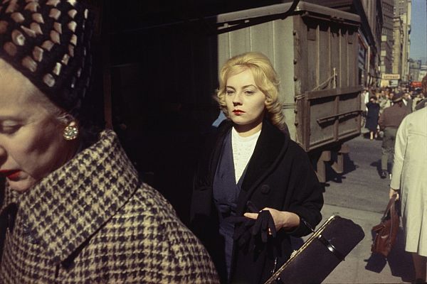
porous, and the states are often simultaneous. In one photo, an elegant woman
stands on a sidewalk full of men—in her black dress, with her black gloves, a
circle of white pearls around her neck, her solitude like a bubble on that
crowded street. Winogrand’s Coney Island photographs are particularly deft in
their evocation of the ways we are alone in crowds: the man smoking in the
dappled shade and sunlight beneath the boardwalk, surrounded by the blurred
bodies of others; a boy’s face close-up, his cheeks and jawline caked with
sand, someone else’s feet disembodied behind him. Solitude is not the opposite
of public gathering, but one of its constituent threads. A public space is
nothing more than a collection of opaque faces, each one a mystery of loss and
longing, like a silent disco—strangers listening to different songs, all their
bodies dancing together.

On Winogrand’s street full of splendid strangers, people kept disappearing. This
was part of the exhibit’s design—every horizontal slide clicked to a new one
after eight seconds, every vertical slide after 13 seconds—and there was
excitement and frustration and pathos in their rotation. It replicated the flux
and flow of the public spaces Winogrand documented, the way strangers rise like
visions and then flee from our sight; the way someone might get off the subway
just as we’ve started to build a story to explain her puffy eyes: her secret
affair, her broken heart, her sick child. “The woman in the yellow swimsuit
looks like you!” my friend whispered in my ear, but by the time I looked up,
she was gone. When I raised my cellphone to capture two people wearing foil
sunbathing collars—looking like flowers in a kid’s play, their faces framed by
golden petals—they’d already disappeared before I could pin them in place, trap
them for good, make them my own.
If
Winogrand’s strangers kept fleeing, perhaps that’s why I kept returning—so I
could keep finding them again. More than any other museum exhibit I’ve ever
seen, it was one I was hungry to come back to. The photos kept revealing new
layers: How many times had I seen that couple embracing on a towel before I
noticed the rough layer of stubble lining the inner curve of her armpit—that
sudden intimate shadow? And how many times did I see the bronzed man doing a
handstand at the beach—balanced on the supine body of another man lying across
the sand—before I noticed how their hands were clasped together, their fingers
interlaced?
The
exhibit, on display from May to December, held—like a long exposure—the ways my
life changed in that time. On our first visit, my daughter sat quietly in her
stroller, still a baby sucking her two fingers. By early fall, she’d become a
busy toddler, full of plans—she wanted to run around the exhibit, to grab the
pen I was using to take notes. She no longer wanted to observe the energy of
these photographs; she wanted to embody it, channel it, claim it for herself.
The exhibit took me from early separation to the horizon of divorce—as if
marking the time I spent crossing the long hillside of that pain. Winogrand had
taken many of the photographs I was looking at in the midst of his own divorce,
bringing his children on outings to the New York Aquarium and the Central Park
Zoo. I felt I could see the ghost of this backstory in his zoo photographs—in
particular, how they held pain and wonder side by side. Szarkowski saw in these
zoo photos proof that Winogrand could find beauty even in cloistered or
sorrowful places: “His appetite and affection for life is so great that even
this scarred and crippled version of it is capable of moving him to sympathy.”
On days
when I found myself simmering with resentment, locked in endless internal
arguments—the kind you keep litigating, even if you know you can’t win them—I’d
take my daughter to Winogrand and let the world get large around my anger. That
felt more possible than “letting go” of it, and certainly more possible than
resolving it. I could just show up in the hallway of strangers and let them
surround it. In recovery, people like to say, “Sometimes the solution has
nothing to do with the problem,” and Winogrand’s photographs had nothing to do
with my problems. They just reminded me of the ordinary, infinite world—how it
was still there, waiting. How do you make a photograph that’s more beautiful
than what was photographed? This spring, his photos asked me to believe there
was a more beautiful version of everything, even the ugliest, messiest
struggles—if you could just regard them from the right angles, crop them the
right way, capture them at the right moments, recognize the core pulse of their
humanity.
Though
for many months I kept my back to the men in the “White Masculinity” section, I
eventually turned to look at them too, in all their pathos and fallibility,
their bruised and blustering egos: men in suits, men at football games, men
smoking and taking photos of flowers and gazing at naked mannequins in a store
window. An elderly man with his head thrown back, laughing. Ha! And I was
actually happy for him, for whatever he was laughing about.
Once, I
was kneeling beside my daughter’s stroller, feeding her Cheerios to keep her
quiet for a few more moments, and it felt so right to be on my knees in that
darkened room—as if I were praying to the sunlight glowing on the skin of all
these ordinary human animals. Every one of them was fighting a great battle.
The
first time I came to Winogrand without my daughter was on Mother’s Day. Sunday
was the afternoon each week that she spent with her father. Missing her was a
primal sensation: I could feel my heart beating toward hers, across town,
toward her seashell toes, the wispy brown curls at the back of her neck, her
Cheerio breath. Her absent stroller felt like a phantom limb. At the museum
entrance, I reflexively went to the special stroller door. The lobby was full
of mothers with their children. The world was full of babies whenever mine was
somewhere else.
The
Winogrand exhibit was full of babies that day, too: a tattooed hand holding a
baby in a sky-blue coat; twins in a double pram, in matching white hats and
matching white blankets, their matching blue eyes staring wide—staring at me. A
toddler in the park held a baby doll of her own. Everybody wanted her baby close!
Other photos held the girl my daughter might someday become: a girl hoisted up
to see a city parade, with long, coltish legs and double-buckled Mary Janes; a
girl drinking a Coke in the shallow end of a swimming pool.
Missing
my daughter was a bottomless feeling. I’d never needed art so badly as I needed
it that day. I needed to be delivered from myself, back into the richness of
the world; needed to be reminded that beauty could surprise you, that it was
lurking in the strangest ruts and crevices—a tray of relish dishes gleaming in
the sun, a huge parking lot skirting the base of snow-capped mountains. The
faces on those walls were faces I would never know—faces that were no longer
themselves, that were 50 years older, or else dead—but they’d be part of me
forever, in their sublimity and anonymity, preserved in the amber of the spring
and summer’s ache. Sometimes the solution has nothing to do with the problem,
and missing my daughter was not something to be solved. It was something to be
met with stunning, unspeakable, regular beauty, and then left intact—pain
living behind the radiance, its shadow and also its spine.
The
Photographs That Made Me Feel Less Alone. By Leslie Jamison. The Atlantic , December 2019.

Scenes
of the American past slide past, projected onto the walls. A girl in a summer
dress stands next to a polished shop window. Office workers in Mad Men-style
skinny ties stroll through a city park. A woman in a patterned hair wrap
perches at a lunch counter, the diner around her a delirious fantasy of pink.
The colours – warm reds, rich ochres, delicious azure blues – make you want to
stretch out in the sun. There’s a nostalgic clickety-clack of an old carousel projector
coming from the next-door gallery. You half expect to hear Sinatra on the radio
and catch the scent of frying hotdogs.
What
makes this time warp even more disconcerting is that the person responsible for
these nostalgia-drenched images of the US in its post-war pomp is the
photographer Garry Winogrand. Known for guerrilla-like, black-and-white frames
of urban America in the 60s and 70s, Winogrand has a claim to be regarded as
the godfather of street photography, a cross between the 1930s crime
photographer Weegee (whose sense of ghoulish brutality he channelled) and Diane
Arbus (whom he knew and exhibited alongside).
Kinetic,
frighteningly alive, often shot at canted angles, Winogrand’s images are almost
literally in your face. In their subjects’ faces, too: many of the people
Winogrand photographed in New York and elsewhere look on the verge of punching
him.
Yet when
you look at these new pictures, all in colour, you wonder if you’re familiar
with him at all. The purpose of the Brooklyn Museum’s summer exhibition is to
show us a different side to Winogrand – more intimate, perhaps more
sentimental. It brings together 450 images, most of which have never been seen
in public before. Even if you know his work – in fact, especially if you know
his work – it’s a revelation.
Chief
curator Drew Sawyer explains how the show came about. Some of Winogrand’s
colour photographs have been exhibited before, but it wasn’t until Sawyer and
colleagues travelled to the photographer’s archive in Tucson, Arizona that they
comprehended how many there actually were – something like 45,000 Kodachrome
slides. “Most had never even been printed,” Sawyer explains, grimacing slightly
at the memory. “I didn’t really know what we were dealing with.”
Born in
1928 into a working-class family in the Bronx, Winogrand had a tough childhood.
Money was tight, and Winogrand was restless without quite knowing what to do
with that energy. He flunked out of high school, only gaining his diploma after
joining the US Air Force. Then he dropped out of Columbia University, too –
abandoning his painting studies after
trying out a friend’s camera and joining the university photography club. After
submitting images of a woman passed out drunk on the pavement to Life magazine
in 1950 – revealing as to his developing style – he got his first magazine
commissions. At the age of 22, without quite intending to, he had become a
professional photographer.
For the
next 35-odd years, Winogrand worked at a manic pace – making sports
photographs, magazine series, adverts, and teaching, as well as spending days
on end in the arena he loved most of all, the hustle of the American street.
Although he became a respected figure, exhibiting alongside Arbus and Lee Friedlander
in the seminal New Documents exhibition at MoMA in 1967, he was starting to
drift out of fashion. It was only after his premature death in 1984 that
Winogrand was recognised as one of the greatest US photographers of the 20th
Century, a worthy heir to Walker Evans and Robert Frank.
Yet he
is also a puzzle – not least because he shot so much. It was said that
Winogrand took pictures so quickly that people in front of his lens didn’t
realise he had actually pressed the shutter. A recent documentary, entitled All
Things Are Photographable, estimates that he took something in excess of 1
million photographs. Many have never been properly scrutinised. The influential
MoMA curator John Szarkowski, a great champion, wrote that in the final years
of Winogrand’s life the photographer was “like an overheated engine that will
not stop even after the key has been turned off, shooting roll after roll of
film, not even bothering to develop them”. Asked why he made photographs,
Winogrand once drolly remarked that it wasn’t to tell stories, but to see “what
something looks like to a camera”. He seems to have stopped caring what his
images looked like, even to him.
Susan
Kismaric, a veteran curator and writer who knew Winogrand well, compares seeing
the colour work to discovering a new period to Picasso’s life that no one fully
realised was there. “There’s this aspect of his work that we didn’t know
existed, really,” she tells me. “And this stuff deserves to be looked at.”

For
photographers of Winogrand’s generation, who cut their teeth in the 40s and
50s, colour film was a vexing medium. For a start, it was unreliable and slow
(requiring brighter light and slower shutter speeds), as well as being
expensive to buy and difficult to develop, which put it out of reach of anyone
not on commission from a magazine or an ad agency. Then there were its
associations with family snaps. Walker Evans declared colour “vulgar”. Most
photographers aspiring to seriousness avoided it. It wasn’t until the work of
William Eggleston in the mid-1970s that anyone deemed colour prints worthy of
exhibition in a major museum.
All this
time, Winogrand was busily snapping away – often with two cameras around his
neck (one black and white, one colour). Many of his most famous monochrome
pictures turn out to have a colour equivalent, shot moments afterwards, as if he
was determined to compare the results, or seize something elusive that couldn’t
be captured in black and white. One image in the exhibition revels in the
scarlet floral splotches on a woman’s A-line skirt, which Winogrand frames
against a cobalt-coloured wall. In another, a man reclining on a bench shows
us, probably without realising, his crimson socks (Kodachrome was known for its
vibrant reds). If Winogrand’s black-and-white photographs often seem ready to
explode, the picture frame barely keeping a lid on their energy, here there is
a more sensuous, introspective feel.
“The
work is so beautiful,” Sawyer suggests. “And Winogrand’s work isn’t often
talked about in those terms.”
The
exhibition takes us on a roundabout, canonically American journey – from
Winogrand’s native New York out west, through Arizona, Texas, New Mexico and
California, where he ended up settling in the late 1970s. Even though we’ve
never seen them before, the western photographs feel somehow familiar:
Jetsons-ish architecture, wide-blue skies, that endless irradiating sunlight,
and cars (always cars). A kid in a striped top slips a coin into a vending
machine, perhaps at a motel – a study in acid yellow, snow-white and Coca-Cola
scarlet. A fast-food vendor wrestles with the plastic cover of his stall, the
pink stripes of his shirt chiming nicely with the striped awning above.
But it’s
the images shot in Winogrand’s native New York that feel more surprising. We
see the same hard Midtown streets as in his black-and-white photographs, the
grime and the deep shadowed canyons beneath tall buildings, but that sense of
caged expectation – of horror just around the corner, or narrowly averted – is
largely absent. Everywhere you look there are moments of repose, pauses in the
melee. One picture spies sidelong on a gang of three people loitering on some
steps. They look like caretakers; their uniforms are baby-blue against the
soot-coloured granite of an office block. In a series of images shot on the
pleasure sands of Coney Island, a balding middle-aged man reclines puffing a
cheroot. The blue of his swimming trunks clashes horribly with his colourfully
patterned blanket, but he doesn’t care. He’s in heaven, and so, for a moment,
are we.
One
thing is consistent with Winogrand’s black-and-white work: its sly humour. One
street picture shows a boy with a quiff and a smart sea-blue suit sauntering
after three grown women, his jacket hooked casually over his shoulder. He looks
like he’s about ask them out for a drink. It is one of my favourite images in
the exhibition, perhaps because it takes the ingredients of the black-and-white
shots – that same tight-as-a-drum composition, the same propulsive energy – in
a less menacing direction. No face-offs, no stand-offs. Whatever happens next
in this picture will almost certainly be fun, and funny. Though Winogrand's
gaze in the monochrome pictures is never brutal, exactly, colour seems to put
him in far more forgiving mood. The people he photographs seem more at ease,
too. Forced to slow down – by his Kodachrome film, by the light, perhaps also
by the allure of the colours in his viewfinder – it is as if he finds a
different rhythm to the city.
Asked
why Winogrand took all those thousands upon thousands upon thousands of
photographs, Kismaric says she’s not sure, even now: it was almost an ecstatic
act, she suggests, a way of losing himself in the drama of the world carrying
on around him. “Garry just loved taking photographs,” she suggests. “I think it
was as simple, and as complicated, as that.”
The Man
Who Took 1 Million Photos. By Andrew
Dickson. BBC , July 17, 2019.

The
first time I saw the Garry Winogrand: Color exhibition at the Brooklyn Museum,
I thought that I heard music playing. There was nothing in my notes to
corroborate this false memory. Yet, when I stepped into the darkened gallery
the second time, I did honestly expect to hear something plaintive and kind,
languorous and poignant. Though that music only exists in my head — something
perhaps like Rachel’s Music for Egon Schiele — the show lingers in my
consciousness like a song that’s found my frequency. I suppose this response is
helped along by the arrangement of color slides in the gallery. They wink in
and out of existence. The images are paired in small visual novellas. One is
displayed along a horizontal axis and the other along a vertical one. The
horizontal images tend to last around seven seconds and the vertical ones
almost twice as long. Over time this makes for distinctly different
juxtapositions as the various images cycle through.
Each
novella has a distinct motif: there were men in a cityscape, people at the
beach (with a sotto voce theme of homoeroticism); air travel; activities at the
fair; and women in an urban environment.
It’s easy for one to get seduced by the beauty of the images. The memorable
ones for me include a boy seemingly asleep on the surf, his face dusted with
sand as if the sandman had struck while no one was looking; a group of
high-stepping Black girls in white and purple band uniforms; the shot of an old
fashioned phone booth with its wings of green glass through which a view of the
city is refracted as if plunged undersea; a bevy of yellow cabs coming together
at intersecting angles; a variation of Winogrand’s infamous shot of a racially
mixed couple each carrying a small chimpanzee; and a shot of the photographer
himself smiling with his whole being.
What one
might miss in all this fascinating visual bounty is that the work is also
sociological. There is a way in which we can tell something about the values
and concerns, the habits and beliefs of the people shown in these slides. It is
a kind of visual ethnography. As I spend time with the work I come to realize
that the men jauntily walking downtown in their tailored suits and the women
with their well-designed coats, jackets and skirts, made more glamorous with a
buoyant string of pearls or colored beads all signify their belonging to a
certain class by their wearing of these uniforms. There are a raft of cultural
markers that indicate that I am looking at a particular people caught in a
particular historical moment. It’s not my moment, but looking at them I can
tell how in the urban areas of the United States we used to deal with public
physical intimacy — an indication of how we generally thought about propriety.
This is clear in the way some couples shyly hold hands. There are signals for
how we treated those we designated as disabled (dark glasses and white cane to
indicate blindness), how we generally viewed femininity (quite rigidly coded),
what abundance looked like (a pile of succulently glazed doughnuts), and how
similar home food was to street food before the hegemony of corporatized fast
food took hold (a lunch counter sign advertises spaghetti for a few cents).

Winogrand’s
street photography is almost always visually compelling, a combination of a
keen sensibility for composition along with a sense of the decisive moment. But
this show is more than that, more even than about the vibrancy of color that
contrasts with his better known black and white work. The exhibition provides a
way for us to take the measure of ourselves: how we’ve regressed; how we’ve
grown; how our values and beliefs have changed, and like a faded tune that was
once played often on the radio, how we used to sing along.
In Garry
Winogrand’s City, a Colorful Kaleidoscope Comes Alive. By Seph Rodney. Hyperallergic , August 12,
2019.

Ars
longa, vita brevis — you know, art is long, life is short — has things
backwards. Reality is inexhaustible, capturing it isn’t. Garry Winogrand
(1928-1984) spent his career trying to prove otherwise. He failed, of course.
You can’t win when reality has three dimensions (four, if you count time), and
photography has just two. Reality also doesn’t need a darkroom. Yet Winogrand
may have gone further in capturing reality with a camera — certainly in
quantity, and right up there in quality — than anyone else in the history of
photography.
It’s
been estimated that Winogrand made a million exposures, nearly 300,000 of them
unedited. He shot pictures the way a machine gun shoots bullets. The sheer
vehemence of Winogrand’s career is even more astonishing than the excellence of
his work. Considering that he has largely come to be seen as the foremost
photographer of his time, and undisputed king of street photographers, that’s
saying a lot.
Winogrand’s
time came at the tail end of the dominance of black and white in serious
photography. It was known that Winogrand had used color, but neither of the two
landmark retrospectives of his work — at New York’s Museum of Modern Art, in
1988, and the San Francisco Museum of Modern Art, in 2013 — included color
images. So “Garry Winogrand: Color” is at once revelation and reimagining. That
Winogrand nervy energy — like a grenade going off, only with phenomenal compositional
values — gets ratcheted up that much more, thanks to the warmer temperature and
greater descriptive power of color. The result verges on visual overload, but
that’s very Winogrand, too.
The
show, which runs through Dec. 8 at the Brooklyn Museum, consists of some 450
slides, drawn from 45,000 color transparencies (once again with Winogrand, the
numbers, the numbers) which he made during the ’50s and ’60s. All the
characteristic Winogrand elements are to be found: energy, surprise,
voraciousness, avidity, dauntlessness, wit, alertness, muscularity, gusto,
slyness, insolence, stunned wonder (that especially). To experience all of that
courtesy of 16 clacking slide projectors, the images projected really (really)
large in a baronial gallery, is to experience a stunned wonder of one’s own.
A man
holds a little girl, presumably his daughter, though we don’t know. Winogrand,
too busy to ask questions, never seeks answers. She holds a balloon. The
verticality of the composition emphasizes lift-off: Girl and balloon bear the
same relationship to ascent. That’s an impressive effect, one that
black-and-white might have emphasized. We’ll never know. What we do know is
that color means we get to appreciate the chromatic interplay of her red-pink
Mary Janes, orange-red coat, and the more red-than-orange coat of the woman
next to her. Underscoring the range of reds is how she’s framed by the grayness
of her father’s sport coat and the blueness of the coat of a girl on the other
side of her.
Sometimes
Winogrand uses color almost against itself. The dress whites of a pair of
sailors dominate the foreground of a photograph from 1960. The slope of their
adjacent shoulders mirrors the curve of the scooped neckline (also white) of
the woman they’re standing behind. The delicate coloration of the street in the
background (Winogrand’s capacity for delicacy is a whole subject unto itself)
supports the whiteness like a chromatic plinth.
The show
begins in an anterior space, with 40 slides that were supposed to be projected
as part of the notorious “New Documents” show at MoMA, in 1967. That show
consisted of work by Winogrand, Lee Friedlander, and Diane Arbus. (The
notoriety came courtesy of Arbus; janitors had to clean off outraged
museumgoers’s spit after the museum closed.) The projector malfunctioned, so
the slide show was removed from the exhibition. But for the lack of MoMA tech
support, how different our sense of Winogrand might have been.
The show
ends with video from a 1983 PBS interview with Winogrand and 25 black-and-white
photographs. In comparison with what’s preceded them, they feel almost sedate —
a word generally not associated with Winogrand.
Within
the main gallery, the slides are grouped by category. Some of them are
self-contained, such as Coney Island. Some overlap, such as On the Road and
Travel. As a means of classification, the final one, White Masculinity, is so
porous — and ex post facto — it would no doubt have made Winogrand roll his
eyes — or wince. Each category has two slides projected at a time. One is
vertical, the other horizontal. Since there are many more horizontals, the
pairs cycle at different rates. This makes keeping track of the images easier,
though part of the pleasure of this wildly pleasurable show is losing track:
surrendering to Winogrand’s sheer virtuoso fecundity. The slowly shifting
images make the experience feel slightly cinematic, like an intimation of being
on the street with him.
Winogrand
would often carry two cameras: one loaded with black-and-white film, the other
with color. Sometimes he’d shoot the same subject a few seconds apart with
each. There are color versions, for example, of the famous image of an
interracial couple holding a chimpanzee and of two women walking outside at Los
Angeles International Airport. In both cases, the black-and-white one is
better: more visually tense and pared-down.
Color
started to become acceptable for serious photography in the ’70s. Among the
most prominent practitioners were Stephen Shore, William Christenberry, Richard
Misrach, Joel Sternfeld, Jan Groover, Joel Meyerowitz, and William Eggleston.
The key figure was Eggleston. Several Winogrand images look wondrously Egglestonian.
Great eyes view alike? You could say that, yes. A 1966 shot of a table full of
condiments, taken on Cape Cod, is a case in point. Yet Eggleston and Winogrand
radically differ in intent. “I am at war with the obvious,” Eggleston has
famously said. You can imagine Winogrand countering with, “OK, define obvious.”
Where
Eggleston imbues the banal with majesty. Winogrand refuses to recognize the
relevance — maybe even the existence — of either category. Taking everything on
its own terms, he takes nothing for granted. He lets us see, or forces us to
see, the everyday in altogether new ways. Who knew that cotton candy could look
so lethal or a Coke machine so imperious or cowboy hats so ridiculous? Well,
that last one you already knew. The point is that Winogrand doesn’t impose the
ridiculousness. It’s already there, inherent and definitional. Judgment, of any
sort, is as alien to his sensibility as finickiness.
These
images are a gold mine for social historians: the details, the juxtapositions,
the in-amber preservation of that present (his) into this present (ours). Yet
Winogrand was emphatic on the inherent abstractness of his photographs — of all
photographs. The most famous of many statements to that effect is “I photograph
to find out what something looks like photographed.”
This
makes “Liz Johnson Artur: Dusha,” also at the Brooklyn Museum, intriguingly
complementary to the Winogrand show. Her photographs and videos in the show
(there’s a sound collage, too) are unthinkable outside of society. Society was
as much of an afterthought for Winogrand as the shade of matte is for a
photograph. With Johnson Artur, it is the photograph.
The
child of a Ghanaian father and Russian mother, she was born in Bulgaria in
1964, grew up Eastern Europe and Germany, spent time in Brooklyn, and currently
resides in London. Such an experience of society — or societies — makes the
turbulence of a Winogrand street seem like a waxworks by comparison.
“Dusha”
means “soul” in Russian. One of the videos consists of interviews with
African-Russians. Fascinating in itself, it’s indicative of Johnson Artur’s
fascination with the collision of cultures (culture A + culture B = society
C?). Out of that collision comes a fundamental tension: a consistent vibrancy
shot through with sorrow and often anger. As fundamental tensions go, that’s a
compelling one.
Garry
Winogrand, that master of black-and-white, was a master of color, too. By Mark
Feeney . The Boston Globe , June 20,
2019.

Garry
Winogrand remains a larger than life figure in the world of photography. His
chaotic images of jostling crowds and perturbed passersby reveal, in the best
of his work, the chaotic intimacy of major metropolitan areas. People are
smashed into tight spaces, are hiding in shadowy corners, or rushing to their
office after lunch.
Winogrand
meets their energy like passing glances, squeezing as much into the frame as
possible before it disappears. “The pictures are tilted, skewed, unsteady,”
wrote Geoff Dyer in his book, The Ongoing Moment. “There is nowhere for our
gaze to rest because, in these pictures, nothing is at rest—least of all
Winogrand himself.” At its worst, his kinetic style can seem leering and
aggressive, the reciprocal nature between the artist and subject feeling more
like an unprovoked attack.
There
have been ebbs and flows to the perception of Winogrand over time. By the
mid-to-late 1970s, his work, while still revered in some circles, was coming
under scrutiny. His 1975 book Women Are Beautiful was criticized for its macho
aesthetic and lack of focus. The critic Arthur Danto, comparing his work to
that of Robert Mapplethorpe, wrote that it was “extremely aggressive” and
“predatory.” By the end of his life, Winogrand was living in Los Angeles and
shooting roll after roll with no direction in mind. Often, he would shoot from
the passenger seat of a car, letting anything that happened to be out the
window come into his frame.
When he
passed away from gallbladder cancer in 1984, he reportedly left behind around
2,500 rolls of undeveloped film and 4,000 rolls that were processed but never
printed. At the time, most of it was deemed unworthy of exhibition.
But
times have changed. Winogrand is having a resurgence of sorts. Last year saw
the release of both the documentary Garry Winogrand: All Things are
Photographable, directed by Sasha Waters Freyer, and the book The Street
Philosophy of Garry Winogrand, a series of 100 photographs accompanied by
short, discursive essays by Geoff Dyer. And beginning on May 3, the first
exhibition dedicated to Winogrand’s color photographs—a largely ignored part of
his body of work—will open at the Brooklyn Museum.
The
color work shows a different side to Winogrand. Much of it seems out of
character, less hostile than his more black-and-white work. There’s more warmth
and stillness. Most notably, this can be seen in his color pictures at the
beach, where the energy is less haywire than the street. People still fill the
frame, but they are in repose. In an untitled picture that is undated, but
based on appearances most likely made in the mid-1960s, we see various legs in
the sand. Some are tangled together, others stretched out and still more
languidly moving to another spot. Movement has slowed down.
In
others from this period we see subjects, usually young men, actively matching
Winogrand’s gaze; some even begin to pose, flexing their shirtless muscles.
This is rare—when a subject stares directly at the lens in a Winogrand
photograph there is often a sense of danger, as if the man holding the camera
has been caught doing something illicit. Here, there is mutual pleasure
extending from watching and being watched.
It’s
worth comparing these to other Winogrand pictures from the beach, such as Coney
Island, New York, a black-and-white photograph from 1952. From the back, we see
a man lifting a woman in the ocean. In midair, her legs kick the water,
splashing out of frame. She seems to be in fear while others in the ocean—a
young boy toward the foreground, two older men in the background—either look on
with amusement or don’t notice at all. This could be playful or this could be
violent. The image holds you in the uncomfortable space between the two. Or
another image from the same beach shot six years later, where Winogrand catches
a few people hiding from the sun under the boardwalk. The only issue is that
the man in the center of the frame, from where the camera is positioned,
appears to be headless.
Color
seems to be a working method that allowed Winogrand to be more conscious of
what he was shooting. The zippy, adolescent glee of the black-and-white
photographs is replaced by a controlled play of hues and tones. In Untitled
(Cape Cod), from 1966, a simple shot of condiment bottles on a table becomes a
dance of bright yellow mustard and deep red ketchup. Or Untitled (New York),
from 1960, where a black woman, wearing a flowery dress, stares at the ground
in front of a bold blue wall that seems to match her shoes.
But for
all the above photograph’s merits, it still speaks to the main problem with
Winogrand’s work—its treatment of women. They are often isolated, or framed
around being looked at (as in the case of a color photo in the exhibition that
shows two sailors gazing down at a woman waiting to cross the street). There
are more images of just women, alone in a picture, than of men, who are mostly
allowed to be joined by friends or colleagues. This stretches across all of his
work, and reveals more about the photographer than his subjects.
Winogrand
once asked: “How do you make a photograph more beautiful than what was
photographed?” It’s admittedly a difficult task, and one that few photographs
have mastered. Winogrand only achieved this a few times, and the one that comes
to mind most readily is included in the exhibition. Untitled (Coney Island),
shot sometime between 1952 and 1958, shows two men framed from the chest up.
One is shirtless; the other has his sleeves rolled up and rests his head on his
friend. They are tired, sunbaked. Winogrand captured them in this brief, quiet
moment, splashed in chromatic splendor, revealing a gentle tenderness among
men.
Street
Photographer Garry Winogrand’s Beautiful, Difficult Work Is Suddenly
Unavoidable. By Craig Hubert. The Observer , April 28, 2019.

Garry
Winogrand's America in Color. A Gallery of Photos. The Guardian. August 14, 2019.


Garry
Winogrand: Color. The Brooklyn Museum