Showing posts with label architecture. Show all posts

26/02/2025

On The Brutalist, Talking With Brady Corbet And Mona Fastvold


“Architecture is a language. When you are very good, you can be a poet.” So wrote the spectacularly good Brutalist architect Ludwig Mies van der Rohe. It’s a fair guess Brady Corbet and his longtime co-screenwriter Mona Fastvold have encountered this quote, and that they recognize the affinities between architecture and movies. Being good in either medium requires a sure knowledge of your materials, an ability to translate imagined designs into physical reality, to assemble and guide teams of inspired collaborators and to know or intuit more than a little about visual textures, space and light and how to move people through them. Another essential requirement: an aptitude for gathering immodest sums of money.

As if to prove how uncomfortably obvious this comparison can be, there aren’t all that many great or even good movies featuring architects as central protagonists, and they almost never leap, as Mies would have it, into poetry. (Notable exceptions include two feverish American movies starring Gary Cooper: Henry Hathaway’s Peter Ibbetson [1935] and King Vidor’s The Fountainhead [1949].) And so The Brutalist stands apart. A passionately inventive epic, bristling with ambition, historical references and allusions to cinematic predecessors, the film showcases larger-than-life performances within a story that both adheres to and challenges timeworn ideas about genius and suffering, art and commerce, personal and collective truth. Yes, Adrien Brody’s dispossessed visionary architect gets blindsided by the contradictions of capitalism after being uplifted and betrayed by a demonic patron (Guy Pearce), but Corbet and Fastvold also want us to track the tenderness and strength of their primary female characters (played by Felicity Jones and Raffey Cassidy), to bring forth a bitter and possibly ironic apprehension of the film’s thematic frame: the Holocaust’s long shadow experienced within the haze of the American Dream.

I made my way through the Brutalistic poured-concrete lobby walls of A24’s New York offices to interview Corbet and Fastvold on December 9th, 2024. We could have talked about their film for a few hours, I felt, and they, on that day, certainly did, as our Q&A was wedged within a tightly crowded press junket. The following is distilled from my allotted twenty-five minutes; the conversation was rounded out later, briefly and over the phone, with Brady alone.

Almereyda: I’d like to start with a blunt, personal question: How did you meet? How did you start working together?

Fastvold: We were introduced by a mutual friend, Chris Abbott, when I first came to New York around 2003, 2004. We became friends right away. I was in the process of trying to make my first film, so Brady and I started working on the script together, then I convinced him to act in it, because he was still doing that at the time. Begrudgingly! You didn’t really want to, but I made you. Chris and Brady both acted in that. Brady and I were editing it together as well and worked on the film the way that we’ve continued working on our films. It’s a very clear director on each, but still we were very much involved with each film from beginning to end. Later on we became a couple, but we made that film first.

Corbet: I think part of the reason we’re still able to work together is because that’s how we met. I think it might have been more difficult if we were a couple and then tried to work together. But it’s sort of the only way that we know how to relate to each other. We’ve always done it that way.

Almereyda: The first time I saw The Brutalist, I was so dazzled by the shot of László (Adrien Brody) emerging into the open light and seeing the Statue of Liberty that I wasn’t really conscious of the voiceover, and I didn’t remember how the movie is framed by shots of the intensely distressed niece: two shots—one dissolves into the next—and then she comes back at the end. Can you talk about why that became important? I assume it was in the script.

Corbet: It was. The screenplay always opened that way, with this brief moment with Zsófia (Raffey Cassidy). I think it’s because we were concerned about contributing to the canon of films about male genius and legacy. These characters were very much written to their circumstances: the character is a middle-aged man because, in the 1950s, of course he would have been a middle-aged man. The characters are Jewish, because it was predominantly Jewish Architects that were at the Bauhaus before it was eventually shut down by the National Socialists. We felt that it was extremely important that the film seems to be about his legacy as it relates to his body of work, when in fact it is about his legacy in the path that he’s forged for his niece having inadvertently given a voice to the voiceless. We wanted to draw everyone’s attention to this character that otherwise would have seemed quite peripheral.

Fastvold: Erzsébet (Felicity Jones) enters into the film right at the beginning through the letters, so we wanted her presence to be strong from the very beginning. She is a female character that we’re not so used to seeing in these types of films about brilliant men. It was important to us to show this relationship that we recognize so much more—other artists that we know, couples with two intellectuals who respect one another—instead of this cliche of the sad housewife at home who’s angry that he’s fulfilling his dreams and she’s not. That’s not Erzsébet at all; she says, “You should go and make whatever the hell you want to make and I’m going to support you. I understand what you’re making and why you’re making it, but stop being such an asshole about it.” What she’s saying is, “Don’t lose yourself in it.” She has perspective that he doesn’t. We can both play that role with one another, to say, “Don’t lose perspective. Come back down to earth. Ground yourself. See this from a pragmatic point of view.” And I thought that her character being portrayed that way versus this other cliche—


Corbet: This doting housewife—

Fastvold: Yeah, or frustrated, where she’s like “I don’t understand why you’re not thinking about money and food on the table.” She says, “I’ll take care of it. I’ll figure out that. Just don’t lose yourself in this toxic relationship.” Because she’s not fooled by him at all. She sees who Van Buren is from the get-go.

Corbet: It’s something that’s usually celebrated after the fact, but as you well know, making something requires a level of obsession that always borders on the unhealthy. You are, in fact, putting all of your relationships second. It’s the only way that these things tend to get off the ground. I mean, now more than ever, when there’s not a real appetite for very transgressive or radical or ambitious movies anymore, or films that have a poetic logic.

Almereyda: That’s a great way to put it.

Corbet: That is just something that’s not widely embraced at the moment. You have to just kick the tires over and over again. Films tend to get made as long as you don’t stop making them. It took seven years, but it could have easily been another 10 to 15. Look at what Jon [Jonathan Glazer] went through bringing Under the Skin to life. How many iterations were there? Or Coppola this year with Megalopolis. It can be an even longer journey. So, I can’t really complain too much about the fact that it took as long as it did, especially given that COVID was smack dab in the middle of all of it.

Almereyda: You landed in exactly the right spot. I read about your initial cast, and it seems like you’ve transcended it. You wound up with exactly the right people.

Corbet: Yeah, these projects are pretty self-selecting. The people that you should be working with are usually the people that you do end up working with, because [the parts are] very difficult. On the page, I think that most actors know right away whether or not they can pull it off, and they’re really big asks. The Hungarian accent alone can easily drift into Bela Lugosi territory if you’re not really careful. Everyone that worked on the movie had a really strong sense of what to do with it. I don’t feel that we teased these performances out of the cast. Everyone came really prepared. We’re fortunate that as we’ve gotten older and have a body of work that gives context to who we are and what we do, normally now the people that show up to work with us know what they’re making. Which is really helpful, because when we first started out, it was different. People didn’t know what to make of it. They thought “OK, I like it enough maybe to be involved,” but they didn’t know exactly what they were making. But with this film, everybody was excited to be making this movie with us, and I feel like that was the first time we’d ever really experienced that.

Almereyda: I know Ethan Hawke is a big fan of the movie, and we made a biopic about a tormented genius that was also made for very little money—much less than yours—and one of my regrets, especially in relation to your film, is that I didn’t allow the character to stop sulking in disappointment, fuming about being thwarted and cheated. Adrien Brody’s performance has so many wild mood swings. So many displays of joy—exaltation and triumph countering every episode of disappointment. The pendulum swings are part of the great energy of the movie. How much were you conscious of giving him these highs and lows?

Corbet: On the page, the character was a lot colder, and there is a natural warmth that Adrien imbued the role with. Even in the sequence that establishes his impotence at the brothel in the beginning of the movie, there’s still something sweet about him. That’s something that’s hard to plan for. One of my good friends saw the film, who also read the screenplay, and was like “I was really surprised by the fact that there’s so much warmth and joy in the movie.” I think that as a filmmaker it’s so important that if somebody has a better idea, don’t shut it down. I’ve really learned that the sort of myopia of conceiving of a project—that’s one thing and that’s one part of the process. But if you don’t share it with everyone—if that warmth was something that I had tried to stifle in Adrien’s performance, I just don’t think it would be the same film. If there’s a new texture or a new color, I always try to remind myself that just because it’s a surprise doesn’t mean that it’s wrong.

Fastvold: And Alessandro Nivola and Adrien had just immediate chemistry. They played off each other so well. There’s that playfulness that Alessandro brought out of Adrien’s character. That was a history that he chose for the characters that’s just hinted at in the script, but they really played into it.

Almereyda: That makes the betrayal more hurtful.

Fastvold: Yes! And I think it was a great choice of Alessandro’s to bring that into the relationship. There’s this little moment when they finished the library and they’re doing this little tap dance moment that they just improvised. Or did you tell them to?

Corbet: No, they totally improvised it. What I loved about it too is that those guys are both so clever—it feels very of the period. Normally, as you know, when you’re making a period piece, you don’t invite a lot of improv because people start saying things like “like,” “um,” “awesome.” But their point of reference for all of this was so strong. Alessandro’s grandfather, for example, is Constantino Nivola, a sculptor that had sculptures in many of Breuer’s lobbies, so he really understood what the film was about. Everyone was really connected to it. And Felicity, who doesn’t have a family history in common with the character, it was just subject matter that she was really passionate about and interested in. 85% of the people that might have been right for the roles physically, they just didn’t get it. That’s what I mean when I say the project was self-selecting, because it ruled a lot of folks out.

Fastvold: Felicity also infuses her with so much warmth and strength, which I thought was crucial for the character. Same with Adrien. It could have been played much darker. Obviously, the successes and failures of the character, they’re scripted. But the specificity of his enjoyment of it all is something that I really love in good performers.

Almereyda: It gives you a full human being.

Corbet: Yeah, Adrien, like, eating an apple! He just keeps on doing it. As I cut, he’s like “I’m not quite done yet.”

Almereyda: I want to get back to what you’ve called the poetic logic of the film. It’s a film of great oppositions, thematically, that get translated into images and dramatic conflicts. But one of the things that’s amazing to me is how history is active within the film. This is shared with The Childhood of a Leader, the feeling that history is like an underlayer, like canvas showing through a painting, but it’s also a shadow pressing down on the characters. One of the ways that you key the audience into this is with archival footage and music, rooted in history. How much of that is done in advance? How thorough and deep does the research go before you start?

Corbet: Some of the archival sequences, for example, were scripted, and some were found along the way while we were pulling stuff for those sequences. That extraordinary footage we found on the history of the Christian tradition and industrialization in Pennsylvania, when we found that we were like, “Oh, well, we’ve got to open the movie this way. I mean, this is so fantastic.” I often speak about W.G. Sebald, Robert Musil, Ingeborg Bachman, V.S. Naipaul and Paul Celan—a handful of writers who have this feeling for history that is in the text that transcends the linear nature of the way that we’ve been taught history, where it’s just basically dates and events, cause and effect.


Fastvold: “This is a fact. This is what happened.”

Corbet: It’s not fungible!

Fastvold: Who knows? I mean there’s of course facts, but when you start writing history, it all becomes slightly fiction as well. There are always details and parts of it that are—

Corbet: —invented by the storyteller. I just feel a more honest relationship with history from Sebald than I do from even great historical writers like David McCullough, because they found a way to this concussed feeling of the trauma and burden of history. And the fact that this is something that we carry with us all the time—

Fastvold: —connecting events that are not obviously connected. I think it’s what Sebald does a lot. He speaks about something that happens in one part of the globe, and then another, completely unaware of each other, but somehow these events speak to him.

Corbet: A butterfly flaps its wings. But it’s one thing to say it, it’s another thing to feel it. And I think it’s the reason that I’m constantly doing these historical projects. I’m using the same actor to play a character and then that character’s child or family member. It’s because it’s one thing to say that history repeats itself, it’s another thing to feel it as a viewer. There’s something about it that’s quite disturbing. It really challenges the system of belief that you have built over the course of the entire film.

Fastvold: It’s a little Brechtian in that way where you’re saying like “Wake up and let’s talk. Let’s look at the ideas and the things that we’re talking, not just be lulled and seduced.”

Corbet: It’s an architecture which reveals its nuts and bolts.

Fastvold: Similar to Brutalism.

Almereyda: Absolutely. There’s a quote from Goethe read in voiceover early on, in Erzsébet’s letter: “None are more hopelessly enslaved than those who falsely believe they are free.”  That’s obviously important to you. Did you have that going into the film?

Fastvold: I don’t know when it came to me in writing that letter. I just don’t remember when I stumbled upon it or how. But it somehow felt right. I wanted us to know that the person writing was a person who had knowledge of history and literature. The way she’s writing to László has almost a sense of humor, albeit a very very dark one, but still saying, “It’s as bad as you thought it would be, not worse.” And all these things establish the way that the two of them spoke to one another. It’s important.

Corbet: I also think that there’s never been a period of my life where I wasn’t reading Goethe.

Fastvold: That’s true. (Laughs)

Corbet: There’s only a handful of writers that are just always there. It’s so rich and it just feels like the foundation for almost all great literature. It’s sort of like, okay, well you had Homer, then you had Goethe.

Almereyda: 300 years later, he’s still going strong. But that opposition between freedom and imprisonment is one of the many polarities in the film. It’s very dramatic and very clear. Two words that get thrown around, or woven into the film, are “beautiful” and “ugly.” How conscious or careful were you in how those words come up? Because they felt very intentional and strong.

Fastvold: They are, but they are also funny. I mean, “beautiful” and “ugly” is completely subjective, right? So, it’s funny László is using it as an insult—twice! Most of all “ugly,” to me, is childish, almost because it’s so subjective to say.

Corbet: But artists are sort of juvenile. One has to hold on themselves across so many decades; there is a part of every artist I’ve ever met that has just never changed. I remember working with Michael Haneke many years ago and Michael had quite a juvenile sense of humor—in the loveliest way, because it was very disarming, especially when you’re expecting the maestro. I always found him surprisingly delightful. In my experience, serious work is not necessarily made by serious people, so there is something in this portrait of an artist that we wanted to explore. We didn’t want to rehash the tortured genius in a way that that one might fall victim to.

Fastvold: It’s not about “This is so brilliant, this construct of all my brilliant ideas creates this marvelous thing.” He’s like, “This is beautiful and interesting, and what you’re doing is ugly and stupid.”

Corbet: At least he’s in pursuit of a progressive idea. Whether the building is beautiful or not, I don’t even really know.

Almereyda: One of the other elements of humor comes from Guy Pearce’s performance—nailing Van Buren’s pretension and self-deception. In any case, I think the film carries a lot of traditions on its back, a legacy of references and ambitions, but the way sex works in the story is unusual, unexpectedly bold. How much did you calibrate the explicitness of it?


Fastvold: I love writing sex scenes and love scenes in films, because I think it’s so important. It’s such a wonderful tool to show a relationship, to understand a relationship, without spelling it out, without talking about it. It’s a wordless way that we can communicate through images the subtleties of that dynamic. Of course, there were parts of the story that explore sexual violence, but that is not about sex, that is about power. The love scenes to me were really a way of showing how Erzsébet is stronger in many ways than László, and how she can hold their trauma—not just hers but his as well. They’re reclaiming their bodies, which have been taken from them.

Corbet: That’s exactly why, in the first five minutes, it was so important to be confronted with his impotence—here he is, completely unable to perform after what he’s been through—and then to see the journey of becoming a human being again. Finally, there’s also something kind of funny about the upside of drug abuse, which allows these two characters that couldn’t really connect prior to that night. There’s one last thing, which is a technical thing, but it’s something that I feel like you might really appreciate. The sex scenes were all shot by putting a 435 into service mode. So essentially what it does, because the aperture never closes, is it streams the highlights and gives the images this extraordinary quality where it’s like an Aura-cam. You can see both of them and the glow of their skin. [An “aura cam” is a toylike camera employed by psychics to track a person’s aura, naturally, as displayed in a range of soft gassy colors.]

Almereyda: I was wondering about that. And how did you discover it?

Corbet: Lol Crawley and I love this film, Love is the Devil, about Francis Bacon from the early 90s. John Mathieson shot it and there was something very interesting, which was that they couldn’t access Bacon’s paintings. And because of that effect, without the cardinals and stuff, of the streaming highlights that come from all of the Bacon paintings, they figured out how to evoke those paintings. Lol and I had never seen it before and we don’t think we’ve seen it since, so it was really this insane process of trial and error. Because the first time that we shot with it, nothing ended up on the negative. It was an extremely expensive process because it’s like ceramics; you’re not paying for the bowl, you’re paying for the bowls that broke. It was a bit like that. And you know, the third time was the charm. And Mona shot the sex scene while we were busy shooting something else. Mona shot a lot of the most beautiful stuff in the movie. We kept stumbling when we were trying to do it, because you have to put tape on the camera, so you can’t see anything. Once you put it in service mode, you can’t look through the eyepiece anymore.

Almereyda: The tension between aesthetics and politics is underlined when the story shifts to Italy and a captivating new character shows up, Orazio the stonecutter, who has left the mountains just once, “to beat the corpse of Mussolini with my bare hands.” He says he’s an anarchist, having fought in the Resistance, trapping fascists in caves and dropping stones on them. Is Orazio’s backstory as important as I think it is? How did you decide to present this rhapsodic interlude just ahead of a scene where Van Buren reveals himself to be an absolute villain?

Corbet: The film is sort of a 1950s melodrama. Everything is taken to operatic extremes, and Guy’s character is very much like an antagonist you would have in a film from mid-century a la James Mason. And I felt that this transgression in Carrera had to happen there—it wouldn’t mean the same thing elsewhere. The marble quarries felt like the appropriate visual allegory because the film is very much about this agent who wants to possess that which cannot or should not be possessed. The quarry is a very beautiful place, but a very violent place. We take a bite out of Mother Nature and she gets pretty pissed off about it. There are constant rock slides, it’s quite dangerous, and ultimately it’s one thing for it to be the source of Michelangelo’s Pietà, but now it’s primarily a material that’s used to surface people’s bathrooms and kitchens.

We had this rule that every single character in the film has a backstory and a different relationship with the Second World War. Isaach De Bankolé’s character as well as Guy’s character as well as Joe Alwyn’s character—there are no absolutely peripheral characters. Everyone has a link to the central theme of the movie, which is about this post-traumatic generation processing what happened with the Second World War—with both World Wars really, back to back. I looked at a lot of different guys for Orazio. Salvatore Sansone is predominantly a painter and a writer, and he looks so incredibly iconic, and has this beautiful voice, so I asked if he would do it. He gives it this kind of mystical quality, like the old man in the mountain.

Almereyda: He has a timelessness. It’s rare in a movie for a character to drop in and drop out and have so much impact.

Corbet: He’s a poet. I knew that he would bring this heft to it that other folks wouldn’t, given the short amount of screen time.

Almereyda: It seems that Orazio’s political virtue is fused with his belief in beauty, and then Harrison sort of challenges that idea, with his preening admiration for beauty. Can you talk a little about this moral imbalance?

Corbet: You have two characters, László and Orazio, interfacing with their oppressor. The oppressor has a new face, a new nationality. László and Orazio have a mutual respect, and a respect for the place, whereas for Guy’s character, he’s almost aroused by the impossibility of this two- or three-ton stone that’s been channeled from the earth being pillaged. It really turns him on. When I sent it to Guy, I said “It’s really fetishistic, when he puts his face against the stone.” What’s funny is I watched buyers doing exactly that, putting their cheeks against the marble, when we went to scout. There’s something mystical about it, but it’s also inherently absurd, because it is just a big piece of stone.

Almereyda: Was Orazio’s disembodied dialogue planned to play this way, before you shot the scene, or did you arrive at it in the editing?

Corbet: It absolutely wasn’t conceived that way. The reason we decided to basically lose sync, and trail off in these overlapping voiceovers, was because the fog was impossible for us to control, so we had major continuity issues. I was like, “We’ve already established this language earlier in the film, with the night where Alessandro, Emma and Adrien are dancing to Dinah Shore, when the reality becomes a little like liquid, with flash-forwards and flashbacks to earlier in the evening.” The whole idea was to represent how one might recall that evening, so that when he gets kicked out and Atilla accuses him of making this pass at her, there’s at least a part of you that wonders “Well, I don’t know. Did he? Did I miss that?” So the language had been established that allowed us to do that with Orazio.

Almereyda: When Orazio pours the water over the marble, is that a conventional thing to do?

Corbet: It is a conventional thing to do. It’s essentially the same ingredient that’s in toothpaste, I forget what it’s called, but they cover the stones in it to preserve the stone. Basically whenever a buyer arrives, they pour water on the stone so that you can see veining and assess the quality of the veining.

Almereyda: The whole scene shimmers.


Taking Everything to Extremes: A Conversation Between Michael Almereyda, Brady Corbet and Mona Fastvold on The Brutalist. By Michale Almereyda. Filmmaker Magazine, February 20,2025.  


In the wake of its success at the Golden Globes and its current frontrunner status at the Academy Awards, Brady Corbet’s film The Brutalist has been one of the most acclaimed and discussed films of the year. Not something that its premise as a three-and-a-half-hour film about a fictional architect would suggest.

Andy Hazel from the Curb caught up with Corbet to talk expectations, exhaustion and excellence.

Since it arrived at the 2024 Venice Film Festival, where you won the Best Director prize, The Brutalist has been collecting prizes and getting rave reviews. Are you surprised by this response?

Brady Corbet: I am surprised. It’s hard to have expectations while making a film. After working on post-production for 20 months, you start hoping for the best but expecting the worst—that’s just life. We knew the film’s length, gargantuan as it is, would be a challenge, especially from a relatively unknown filmmaker. But I couldn’t find a way to make it shorter. Every cut felt like it hurt the film holistically. We always knew the movie would be long, but we didn’t think it would be this long.

But also, time is a very important ingredient in the recipe, and when you’re making a movie about a character’s entire life, things could suddenly feel very rushed. The final version of the movie is the screenplay. There’s not a single scene in the movie which is missing. My wife [co-screenwriter Mona Fastvold] and I try to remind ourselves to trust the material.

Executing a movie, there are practicalities that you’re facing because every single day that you’re not delivering a movie it’s very expensive, you start accruing interest on the loans and there’s a lot of pressure to get it done. We talked about the screenplay for a long time before we executed the draft and we executed the draft very quickly, but because we did it early, we didn’t have a gun to our head. I think that you tend to make better creative decisions in that part of the process rather than later.

Is this what success and acceptance looks like for you?

BC: I don’t know. I haven’t had enough time to process the response to the movie. I’ve been on the road since we premiered the film in September and prior to that I was shooting another movie with my wife that she directed, a musical that we wrote together, so it’s been a sort of marathon after marathon the last couple of years.

I hope making the next one is a little bit more peaceful and it comes together a little bit faster. Ideally, I wouldn’t like almost a decade to pass between films every time. But, with success also comes expectations and that’s a reality that I haven’t even really thought about yet. Because post-production on The Brutalist was so long, I’ve already been planning for my next project, and it’s a radical movie in a very different way. I think it’s very important to never repeat yourself.

Can you give examples of how you’ve done this?

BC: After I’d made Childhood of a Leader, I was like, what’s the most dangerous thing I could possibly do? I’d just made a film that was set in the early twentieth century with a lot of heavy drapery and a very specific period style and tone. I thought the most dangerous thing I can do next is to make a movie about right now. I was tired of the lace and linens, and I really needed to do a movie that was all pleather.

Vox Lux was conceived in this bifurcated way, it’s missing a second act, which was the film’s experiment. To omit the passage which an audience anticipates. There’s a sort of brutality to that experience where it’s very difficult to let go of part one, and in part two, it’s a different group of actors, it’s a different tone and style entirely. There was something about that which was quite dangerous and quite interesting to me. But after I made a film without a second act, I was like, maybe for the next one it’s the second, third, fourth and fifth act.

So, I think you’re always in this sort of dialogue with yourself. And with Mona, we’re able to have these conversations where we explore the form and see how much we can bend it before it breaks.

In 2016 you said that you gave up making Childhood of a Leader because the film was too ambitious. Later, you met Mona, and she encouraged you to see it through. Could you talk a little bit about how you work together?

BC: We have different complementary strengths, and we recognised that in one another early on. It’s very helpful to have someone who, when you’re running out of steam, encourages you to keep going. I made Childhood when I was 25, but I had been working on it since I was 20, 21 years old, trying to get this period piece starring a seven-year-old off the ground. I shot the film in 25 days or 24 days, but because we were working with a child, it was only about 8 to 9 hours a day on set. Vox Lux was shot in 22 days, but at least I was working with Raffey [Cassidy] at the time, who had teenage hours that were slightly more forgiving. The Brutalist was shot in 33 days, which felt like a luxury compared to the previous two movies, just to have a little bit more real estate to work with in terms of planning a schedule. But of course, because this was also longer, the screenplay was about 170 pages, so we had to shoot about seven pages or so a day.

That seems remarkable. Your films seem to take a long time to come together, and you have a very clear idea of what you want. What is it that keeps you from compromising?

BC: [long pause] It’s an unhealthy way of living. It requires a level of obsessiveness and stubbornness that’s probably not so pleasant to be around all the time.

Have you always worked this way?

BC: I’m an only child who grew up with a single mother and my mother was extremely supportive. She really treated me with a lot of respect from a very early age, and I try to treat my own daughter with that same level of respect because I remember how much I appreciated it when I was her age. I’m the first generation in my family to work in movies, and I really kind of fell into it.

Pre-Windows 95, the way that national casting calls worked for young actors is that there were about 10 or 12 hubs across the US where all children were cast. So, whenever you were working with another child actor on a project, they always came from one of a handful of the same places. When I was seven years old, I happened to move to a small town, around 10,000 people, that happened to have this very legitimate casting that was happening locally. Because I was such a cinephile, my family encouraged me to audition for films at a young age. Then it kind of took on a life of its own.

As an actor, you’ve worked with directors like Lars von Trier, Ruben Östlund, Olivier Assayas, Catherine Hardwicke and Gregg Araki. How much did you learn from them, and how much did you learn from your own experiences as an actor?

BC: I’m a hundred percent sure that my experience of growing up on film sets gave me a real sensitivity to recognising the insecurities that folks have. Making a movie is exhausting. You’re generally sleeping two or three hours a night because whenever you’re not shooting, you’re scouting or planning for the next day. There’re simply not enough hours in a day when you’re making a movie. So, I think it probably did give me an understanding and an empathy for everyone involved. In terms of performance and anxiety, I really do everything in my power to create a space where people feel really supported. These are serious movies, but it’s important to us that no one feels like they’re being made by serious people. We want it to be a joy to come to work and we always encourage people to bring their kids and make it a familial experience.

In my experience that’s when some people do their best work. Obviously, there are different philosophies about that, but I think it’s important that there are monitors everywhere and that everyone can see what we’re working on. Gatekeeping can occasionally happen on set, when some people really don’t like having actors reviewing takes or anything like that, but I encourage everyone to participate in the process because it helps to orient them. It’s so hard when you’re acting for the camera if you have no sense that we’re on a wide lens or a tight lens.

Most of my favourite actors and a lot of the folks on this film are very technical. They’re very precise about blocking, they’re very precise about the text. There is a lot of dialogue in this film and there would be times when somebody would be struggling to spit out a word, and I’d say, ‘that’s okay, just make the words fit in your mouth. It’s no problem.’ And, and all of them, Guy [Pearce] and Adrien [Brody], would always say, ‘No. It’s written this way for a reason. Just give me a second, I’ll get it’. That was so wonderful.

Can you talk a little bit about casting and working with Adrien Brody? Did you audition him? Did you always have him in mind?

BC: I don’t do auditions. The only time that we ever hold casting sessions on any movie is for when you’re working locally, like we were when we were shooting in Hungary, and you just need to hear that someone can do an American accent or something like that. Some people do auditions that are 10, 13 pages long. That just ruins a performer’s week because they spent so much time memorising the text and I don’t like putting people through that.

But with Adrien, I knew a little bit about his background and his mother was a Hungarian refugee who emigrated during the revolution in the mid-50s. I knew that because he had grown up with Hungarian, it was a great place to start. He is a really fine actor. I didn’t have to coax anything out of him. He just, he read it, he understood it, and that goes for everybody in this movie, and it’s not always like that.


How much of Adrien Brody is in László Tóth?

BC: It’s hard to say. I mean, I always encourage a performer to bring as much of themselves to a role as possible, unless there is a very specific reason not to. Like what I wanted to achieve with Natalie Portman on Vox Lux was something transcendentally maximalist, something like performance art. And so that’s a different sort of very theatrical approach. But with this, the only theatricality that I was trying to keep in mind for not just myself but to remind all the performers was the films I was referencing, Rope and a lot of mid-century melodramas. Michael Powell movies and Doug Sirk movies, so we were sure to sort of evoke their style, especially because we were shooting on VistaVision, which is a camera engineered in the 50s. I wanted all of these things to be in lockstep, but because of the nature of the subject matter of this film, it was also important that there was a level of humanity and that the theatricality not overpower the humanity.

Someone who was very good at balancing those things was the musician Scott Walker, who died in 2019 and to whom The Brutalist is dedicated. He scored your first two films; did you also intend for him to work on this one?

BC: I don’t remember. He passed away just after Vox Lux, so it was early days. I expected to make all my movies with Scott because I didn’t know any other way. When I was finished with a movie, it was like, ‘okay, well, let’s hand it off to Scott’. One thing that was really nice about this project is that Daniel Blumberg, who scored The Brutalist, works with the same co-producer as Scott did, Peter Walsh, so a lot of things about this process were very familiar to me even though Scott and Daniel have a very, very different approach. For this movie, Daniel wanted to construct the tracks. It was part of the philosophy of making a film on brutalism that there were these particular kinds of sounds and processes he wanted to use. With Scott, we did big orchestral sessions and everything was recorded live. The Brutalist score comprises many individual sessions with artists like the saxophonist Evan Parker, pianist John Tilbury or, even Vince Clark from Erasure and Depeche Mode, who worked on 80s Moog synth version of the soundtrack at the end of the movie.

You’ve said that The Brutalist is not a political film, but you’ve also said that Donald Trump is on a mission to have all the brutalist buildings in Washington torn down. How do you feel about the film taking on political overtones on its release?

BC: Of course, all movies are viewed very much through the prism of the time that they come out in. But for me, it’s a funny thing, because my films are not made with a political intent. If you make a film with a political intent, it can segue into propaganda pretty quickly, even if its propaganda in service of a more or less righteous or moral cause.

I really resist interpreting the movies in a political way because I feel that we need a space that is outside of politics.

And I think that it’s important for us to reflect on historical events without viewing them through a political lens. But that said, even though they’re not made with a political intent, a viewer projects onto the vessel and inherently they become political. There’s nothing I can really do about that. If I could go and adjust absolutely everyone’s televisions and to make sure that they don’t have frame blending on and make sure that the movie doesn’t sound or look like shit when they see it [laughs]… at a certain point you give it away. People tend to imbue those projects with meaning from their own perspective and I encourage that.

I want to activate an audience. I want them to wrestle with the material. I don’t want to do all the work for them. I want to ensure there’s enough space for them to really engage.

Finally, how important are awards to you? You won two awards at the Venice Film Festival for Childhood of a Leader and Vox Lux was nominated for the Golden Lion. Usually, festival recognition and awards make funding the next project easier but, so far at least, that doesn’t seem to be the case for you.

BC: The jury in Venice this year was full of a lot of filmmakers and film workers that I really have a lot of respect for, so that was fantastic and very touching. But, you know, to be honest, I don’t even remember who won the Oscar or the Palme or whatever, three or four years ago. I’d have to really sit down and think about it.

I think that it’s very important for the commercial prospects for a movie and that’s really what they’re there for because it allows movies like the fantastic Zone of Interest to make $50 million worldwide. Zone of Interest. That it sold $50 million worth of movie tickets is extraordinary and I think it being recognised by the Academy, the Globes etc. contributed to that. That’s great, but beyond that, to me, it’s not… It’s a lot of pageantry, and sometimes that can be really fun.

But, when you’re done making a movie, you’re just so carved out and exhausted that the last thing you feel like doing is going to a party every night. There is such a thing as too much of a good thing. So, it won’t be until after award season that I’ll have time to reflect on the past few years and hopefully just focus on spending as much time with my daughter as humanly possible because she’s at an age now where I can’t take her out of school as often as I used to. Now, I’m just counting the days until I can be at home for longer than seven to ten days at a time.


“I want to Activate an Audience”: A Q&A with Brady Corbet, Director of The Brutalist. By Andy Hazel. The Curb, January 13, 2025.


14/12/2022

The Intellectual Situation : Why Is Everything So Ugly?


We live in undeniably ugly times.  Architecture, industrial design, cinematography, probiotic soda branding — many of the defining features of the visual field aren’t sending their best. Despite more advanced manufacturing and design technologies than have existed in human history, our built environment tends overwhelmingly toward the insubstantial, the flat, and the gray, punctuated here and there by the occasional childish squiggle. This drab sublime unites flat-pack furniture and home electronics, municipal infrastructure and commercial graphic design: an ocean of stuff so homogenous and underthought that the world it has inundated can feel like a digital rendering — of a slightly duller, worse world.

If the Situationists drifted through Paris looking to get defamiliarized, today a scholar of the new ugliness can conduct their research in any contemporary American city — or upzoned American Main Street, or exurban American parking lot, or, if they’re really desperate, on the empty avenues of Meta’s Horizon Worlds. Our own walk begins across the street from our apartment, where, following the recent demolition of a perfectly serviceable hundred-year-old building, a monument to ugliness has recently besieged the block. Our new neighbor is a classic 5-over-1: retail on the ground floor, topped with several stories of apartments one wouldn’t want to be able to afford. The words THE JOSH have been appended to the canopy above the main entrance in a passionless font.

We spent the summer certain that the caution tape–yellow panels on The Josh’s south side were insulation, to be eventually supplanted by an actual facade. Alas, in its finished form The Josh really is yellow, and also burgundy, gray, and brown. Each of these colors corresponds to a different material — plastic, concrete, rolled-on brick, an obscure wood-like substance — and the overall effect is of an overactive spreadsheet. Trims, surfaces, and patterns compete for attention with shifty black windows, but there’s nothing bedazzling or flamboyant about all this chaos. Somehow the building’s plane feels flatter than it is, despite the profusion of arbitrary outcroppings and angular balconies. The lineage isn’t Bauhaus so much as a sketch of the Bauhaus that’s been xeroxed half a dozen times.

The Josh is aging rapidly for a 5-month-old. There are gaps between the panels, which have a taped-on look to them, and cracks in the concrete. Rust has bloomed on surfaces one would typically imagine to be rustproof. Every time it rains, The Josh gets conspicuously . . . wet. Attempts have been made to classify structures like this one and the ethos behind their appearance: SimCityist, McCentury Modern, fast-casual architecture. We prefer cardboard modernism, in part because The Josh looks like it might turn to pulp at the first sign of a hundred-year flood.

Writing a century ago, H. L. Mencken bemoaned America’s “libido for the ugly.” There exists, he wrote, a “love of ugliness for its own sake, the lust to make the world intolerable. Its habitat is the United States.” However mystical and psychosexual his era’s intolerability might have felt in its origins, by the 1940s the explanations were more prosaic. With the wartime rationing of steel and sudden dearth of skilled labor, concrete structural systems quickly gained appeal — as did buildings that could be made piecemeal in a factory, put on a trailer, and nailed together anywhere in the country. And as the postwar baby boom took hold, such buildings were soon in high demand, fulfilling modernism’s wildest dreams of standardization with little of the glamour. A few Levittowns later, the promise of salvation-by-mass-production would come to seem elusive: new manufacturing techniques were transforming both the buildings and the builders building them. In Prisoners of the American Dream, Mike Davis describes how, in the 1970s, “the adoption of new building technologies involving extensive use of prefabricated structures, like precast concrete, eroded the boundaries of traditional skills and introduced a larger semi-skilled component into the labor force.” If it’s cheaper to assemble concrete panels than to hire bricklayers, cityscapes will eventually contain fewer bricks.

A construction industry with newly decadent profit margins was ready to spring into action in the 1990s, when — after a violent, decades-long process of urban renewal and white flight — real estate developers, brokers, and local politicians started luring predominantly white homeowners and renters back to the cities they’d abandoned. By the 2000s, infill housing began to crop up in American cities that had for decades been defined by their plentiful surface parking. These residential developments were ugly, but not yet inescapable. Like the fresh-faced presidential candidate with whom it’s hard not to associate them (did every wood-and-concrete complex feature a knockoff Shepard Fairey mural, or have we been blinded by the mists of memory?), the buildings spoke to an upwardly mobile, progressive, even post-racial demographic that didn’t share its parents’ all-consuming fear of city life. Then came the ultimate stop-work order: the 2008 financial crisis.

The urban building boom that picked up in the wake of the Great Recession wasn’t a boom at all, at least not by previous booming standards: in the early 2010s, multifamily housing construction was at its lowest in decades. But low interest rates worked in developers’ favor, and what had begun as an archipelago of scattered development had coalesced, by the end of the Obama years, into a visual monoculture. At the global scale, supply chains narrowed the range of building materials to a generic minimum (hence The Josh’s pileup of imitation teak accents and synthetic stucco antiflourishes). At the local level, increasingly stringent design standards imposed by ever-more-cumbersome community approval processes compelled developers to copy designs that had already been rubber-stamped elsewhere (hence that same fake teak and stucco in identical boxy buildings across the country). The environment this concatenation of forces has produced is at once totalizing and meek — an architecture embarrassed by its barely architected-ness, a building style that cuts corners and then covers them with rainscreen cladding. For all the air these buildings have sucked up in the overstated conflict between YIMBYs (who recognize that new housing is ultimately better than no housing) and NIMBYs (who don’t), the unmistakable fact of cardboard modernism is that its buildings are less ambitious, less humane, and uglier than anyone deserves.

They’re also really gray. The Josh’s steel railings are gray, and its plastic window sashes are a slightly clashing shade of gray. Inside, the floors are made of gray TimberCore, and the walls are painted an abject post-beige that interior designers call greige but is in fact just gray. Gray suffuses life beyond architecture: television, corporate logos, product packaging, clothes for babies, direct-to-consumer toothbrushes. What incentives — material, libidinal, or otherwise — could possibly account for all this gray? In 2020, a study by London’s Science Museum Group’s Digital Lab used image processing to analyze photographs of consumer objects manufactured between 1800 and the present. They found that things have become less colorful over time, converging on a spectrum between steel and charcoal, as though consumers want their gadgets to resemble the raw materials of the industries that produce them. If The Man in the Gray Flannel Suit once offered a warning about conformity, he is now an inspiration, although the outfit has gotten an upgrade. Today he is The Man in the Gray Bonobos, or The Man in the Gray Buck Mason Crew Neck, or The Man in the Gray Mack Weldon Sweatpants — all delivered via gray Amazon van. The imagined color of life under communism, gray has revealed itself to be the actual hue of globalized capital. “The distinct national colors of the imperialist map of the world have merged and blended in the imperial global rainbow,” wrote Hardt and Negri. What color does a blended rainbow produce? Greige, evidently.

A  lot of ugliness  accretes privately, in the form of household goods, which can make it hard to see — except on the first of the month. Today’s perma-class of renters moves more frequently than ever before (inevitably to smaller apartments), and on moving day the sidewalks are transformed into a rich bazaar of objects significant for ugliness studies. We stroll past discarded pottery from wild sip ’n’ spin nights; heaps of shrunken fast fashion from Shein; dead Strategist-approved houseplants; broken Wirecutter-approved humidifiers; an ergonomic gaming chair; endless Ikea BILLYs, MALMs, LACKs, SKUBBs, BARENs, SLOGGs, JUNQQs, and FGHSKISs. Perhaps this shelf is salvageable — ? No, just another mass of peeling veneer and squishy particleboard. On one stoop sits a package from a direct-to-consumer eyewear company, and we briefly fantasize about a pair of glasses that would illuminate, They Live–style, the precise number of children involved in manufacturing each of these trashed items, or maybe the acreage of Eastern European old-growth trees.

It occurs to us, strolling past a pair of broken BuzzFeed Shopping–approved AirPods, that the new ugliness has beset us from both above and below. Many of the aesthetic qualities pioneered by low-interest-rate-era construction — genericism, non-ornamentation, shoddy reproducibility — have trickled down into other realms, even as other principles, unleashed concurrently by Apple’s slick industrial-design hegemon, have trickled up. In the middle, all that is solid melts into sameness, such that smart home devices resemble the buildings they surveil, which in turn look like the computers on which they were algorithmically engineered, which resemble the desks on which they sit, which, like the sofas at the coworking space around the corner, put the mid in fake midcentury modern. And all of it is bound by the commandment of planned obsolescence, which decays buildings even as it turns phones into bricks.

Beyond the sidewalk, the street — which is mostly for cars, key technology of the 20th-century assault on the city. Barthes wrote that the 1955 Citroën DS marked a welcome shift in the appearance in cars toward the “homely,” meaning that they’d begun to carry the comfortable livability of kitchens and household equipment. Today’s automobiles, far from being “the supreme creation of an era,” are homely in the other sense of the word. A contemporary mythologist could sort them into either hamsters or monoliths. Hamster cars (the Honda Fit, the Toyota Prius) are undoubtedly ugly, but in a virtuous way. The monolith cars (the Cadillac Escalade, the Infiniti QX80) possess a militaristic cast, as if to get to Costco one must first stop off at the local black site.1 No brand has embraced the ethos more than Tesla, with its tanklike Cybertruck. Even Musk’s more domesticated offerings feel like they’re in the surveillance business: sitting inside a Tesla is not unlike sitting inside a smartphone, while also staring at a giant smartphone.

Dodging huge grilles we walk on, pulled by ugliness toward a gentrified retail strip. Here the violence of the new ugliness comes more fully into focus. The ruling class seized cities and chose to turn them into . . . this? To our right is a place that sells wiggly candles. Past that is a boutique liquor store whose chalkboard sign proclaims, in cheerleader handwriting, that the time is Wine O’Clock, and past that is a Bank of America. Across the street, a row of fast-casual chains, whose names and visual identities insist on modesty and anonymity: Just Salad, Just Food For Dogs, Blank Street Coffee. (This raft of normcore brands finds its opposite in the ghost kitchens down the block, which all for some reason are called things like Fuck Your Little Bitch Burrito.) Up ahead is an axe throwing “experience,” and another Bank of America.

Who asked for all of this? Numerous critics — self-hating and otherwise — have argued that the mallification of the American city is the fault of the same millennials for whom all the new construction was built, who couldn’t quite bear to abandon the creature comforts of home even as they reurbanized. The story goes that millennials lived, laughed, and loved their way into an unprecedentedly insipid environment, turning once-gritty cities into Instagram-friendly dispensaries of baroque ice cream cones that call back, madeleine-style, to the enfolding warmth of their suburban childhoods. But the contemporary built environment is not the millennials’ legacy; it is their inheritance. They didn’t ask for cardboard modernism — they simply capitulate to its infantilizing aesthetic paradigm because there is no alternative. Or if there is an alternative, it’s between an $8 ice cream cone or an $11 ice cream cone (or a $49 ticket to the Museum of Ice Cream).

Our ugliness tour is leading us toward the $11 ice cream cone zone. On the waterfront, the spatial logic of The Josh persists, only at four times the cost per square foot. There is less random yellow, the concrete is glossier, and the view through the precarious glass is a little more ennobling. Too bad about the build quality. One paradox of the new ugliness is that it flattens the distinction between the rich, the very rich, the superrich, and the merely fortunate by ripping them all off in turn. These days housing at the most elite strata sucks nearly as much as the simply bourgeois kind. According to a parade of entertaining New York Times stories, residents of the toothpick-like towers on Manhattan’s Billionaires’ Row complain of elevator breakdowns, “catastrophic” flooding from poor plumbing, and “metal partitions [that] groan as buildings sway” in the wind. Shittiness is a big tent — and the tent is falling apart.


Our dérive has  deposited us near a subway stop. We swipe in with a trusty MetroCard, soon to be replaced by the privately owned data-tracking behemoth OMNY, whose neon-on-black logo recalls the chilly visual identity of another threat to transit, Uber.2 But at least as far as branding goes, OMNY is no uglier than other offenders. Our train car is covered in ads, all curiously alike despite marketing a staggering variety of superfluous stuff. How did workplace management systems, body-positive nutritional supplements, bean-forward meal kits, woman-owned sex toys, and woman-owned day-trading services all converge on the same three fonts? Everywhere we look there are little pool noodle–shaped squiggles, and where the squiggles end, there is muted flash photography that makes even otherworldly models look matter-of-fact. With the exception of the food delivery apps, which flaunt their violent takeover of the city in a meaningless word salad designed for shouting about salad — WHEN YOU’RE SO HANGRY, YOU’D TRASH TALK ANY SLOW WALKER BETWEEN YOU AND YOUR BEC, goes one GrubHub ad — the advertising all seems sheepish about being caught in the act of selling something.

But no single ad is as emblematically ugly as the digital screens that have appeared across the city’s train cars since 2017. Public transit has pivoted to video, and the function of its new giant iPads mystifies: their purpose is neither civic nor fully commercial. Instead, they’re given over to a bewildering set of images for the TikTokified city, the worst of which belong to a marketing campaign called “Moments in Food.” We watch, a little nauseated, as the Moments loop by: video tutorials for Homemade Pesto Hack, Homemade Chipotle Chicken Cutlet Hack, Homemade Three-Ingredient Oven-Free Blondie Hack. Why are there no measurements? Would this even seem edible, in the distinctly non-subwaylike atmosphere of an actual kitchen? Like The Josh’s synthetic not-quite-surfaces, it all seems gesturally foodlike, a step removed from the real thing. Above us, pesto glistens.

Speaking of moments in food, it’s lunchtime. Exiting the train, we pass a food hall, where, again, the theoretical possibility of endless variety manifests as lackluster sameness. Dozens of restaurants’ satellite stalls all feature the same signage, the same subway tile backdrop, the same impression of having been shrunk to diorama size and turned into IP. We turn instead to the outdoor dining sheds. After sprouting with uncharacteristic speed in the first chaotic spring of the pandemic, the sheds have performed a sort of guerilla Haussmannization of the city — in a good way, clawing back public space from cars. The ugliness they’ve introduced to the built environment diverges, happily, from the usual kind. Unruly and old-school, the sheds have pissed off deranged community boards and their mouthpieces in the media. “The shanty outside Dumpling Man on St. Marks is unspeakably hideous,” declared a recent New York article, “its colorless wood fragments hammered together so arbitrarily that you would rather eat in a pile of Lincoln Logs.” Yeah — just the way we like it!

Around the corner is a movie theater, one of those places where they bring snacks or cocktails right to your seat. Filmmaking today is supposed to be more powerful than it’s ever been, capable of representing everything everywhere all at once. As the world offscreen recedes into sameness, movies can and should look great — but onscreen there is more ugly sameness. The thing we wander into is at first indistinguishable from any other blockbuster of the late green-screen era: only after Ryan Reynolds cocks his signature “terror gun” do we recognize this as Army Soldier II, a digitally shot Netflix-financed production based on a TV show based on a comic book. Can a movie be a remake of itself? This is the depleted vibe Army Soldier II and its ilk are giving off. The easy recourse to postproduction — “we’ll fix it in post” — has resulted in a mise-en-scène so underlit as to be literally invisible. Despite its $275 million budget, the movie looks like it was filmed underwater in a polluted lake. The action scenes are nearly monochromatic, the color palette ranging from Tentative Black to what looks like Apple’s proprietary Space Gray. Lighting isn’t a lost art, but subsumed in all that murk, we’re having trouble finding it.

Two and a half hours in, Army Soldier II suddenly becomes a comedy, with Reynolds vamping his way through long, flat takes designed to accommodate his “riffs.” Now everything is overlit, as if the gaffers were only available for the second half of the shoot.

Such bad lighting — and such large portions! We exit the movie theater to a bright realization: our films are exactly as overlit as our reality. As our environment has become blander, it has also become more legible — too legible. That’s a shame, because many products of the new ugliness could benefit from a little chiaroscuroed ambiguity: if the world has to fill itself up with smart teapots, app-operated vacuum cleaners, and creepily huge menswear, we’d prefer it all to be shrouded in darkness. For thousands of years, this was the principle of illumination that triumphed over all others. Louis XIV’s Versailles and Louis the Tavern Owner’s tavern had this in common: the recognition that some details are worth keeping hidden. But now blinding illumination is the default condition of every apartment, office, pharmacy, laundromat, print shop, sandwich shop, train station, airport, grocery store, UPS Store, tattoo parlor, bank, and this vape shop we’ve just walked into.

Surveying a suite of candy-colored bongs, we reflect on the primacy of LEDs. (One of the bongs is bedecked with LEDs.) The shift to cold lighting in recent years was borne of urgent environmental necessity, and we accept that climate change requires concessions. We’re prepared to make those: we will eat crickets and endorse, if necessary, the blockage of the waterfront park around the corner by a giant seawall. We will even help build the seawall! Change is inevitable. But LEDs can appear in many colors, as demonstrated by our new light-up bong. So why this atomic, lobotomizing white?

Outdoors, the situation is depressingly similar. After New York replaced the sodium-vapor lights in the city’s 250,000 streetlamps with shiny new LEDs in 2017, the experience of walking through the city at night transformed, almost . . . overnight. Forgiving, romantic, shadowy orange gave way to cold, all-seeing bluish white. Again environmental concerns necessitate this scale of change, and again we wonder why, when it comes to its light bulbs, New York has chosen to back the blue. Inertia, disinterest, thoughtlessness, yes, but also the promise of increased police vigilance. Still, what is most striking about New York’s ominous glow-up is the sense that the city has been estranged from itself: the hyperprecise shadows of every leaf and every branch set against every brick wall deliver a Hollywood unreality. New York after hours now looks less like it did in Scorsese’s After Hours and more like an excessive set-bound ’60s production. The new ugliness is defined in part by an abandonment of function and form: buildings afraid to look like buildings, cars that look like renderings, restaurants that look like the apps that control them. New York City is a city increasingly in quotation marks, a detailed facsimile of a place.

Gah! Blinded by the intense glare of an LED streetlamp, we bump right into said streetlamp. Fortunately there’s an urgent care across the street, still open in the dwindling dusk. We’re no doctor — at least not until they start giving out PhDs in walking around — but we can tell that our knee is bleeding. If anything is broken, the CityMD’s MD will take care of it. We stumble inside, into the intersection of exploitative private insurance and inadequate public options. Here, like everywhere else, a clash of patterns and surfaces — gray tile, gray bricks, greige wood paneling — enfolds us in a numbing palliative aura. We try to check in at the front, but the iPad doesn’t react to the tap of our index finger. Are we a ghost? Is this the afterlife? The lighting is giving gates of heaven, but as with the supertall buildings and their elevators that never work, our problem is technical: the iPad is frozen. Another one is wheeled out and we make our way through a questionnaire. Allergic reactions? None. History of medical litigation? Huh, weird.

Our estimated wait time is three and a half hours, which gives us ample opportunity to reflect on our surroundings. Is there a more contemporary urban form than the urgent care facility? How did the entire world come to look like this nonplace, flimsy and artificial and built unsuccessfully to stave off emergency? Above our heads, the original Army Soldier plays on a flatscreen, Ryan Reynolds’s leaden features motion-smoothed into alarming definition. Our phone buzzes with a push notification from Zillow: a 0.5-bedroom studio is now available for $4,775 a month in the sub-basement of The Josh. We examine our fellow patients, because nobody else is. The bleeding young man to our left looks to have been the victim of an axe throw gone very wrong. Our neighbor to the right tells us she was hit by a Tesla while e-biking to Roosevelt Island to deliver a single unicorn latte. We overhear someone behind us describe a harrowing food poisoning incident involving a Homemade Chipotle Chicken Cutlet Hack.

In the end we pay $75 for a Band-Aid, two Advils, a Blank Street Coffee gift card, and a branded pen we have no plans to return. After a long day of digital encounters we’re asked to sign a paper receipt, and we click the pen. It looks like a pen and works the way a pen ought to work. Our eyes fill with tears at this satisfying tactile experience. Maybe it’s just the bruising.


n + 1, Winter 2023 


14/10/2022

Hypnerotomachia Poliphili by Francesco Colonna


With its otherworldly woodcuts and ornate descriptions of imagined architecture, Hypnerotomachia Poliphili brims with an obsessive and erotic fixation on form. Demetra Vogiatzaki accompanies the hero as he wanders the pages of this quattrocento marvel, at once a story of lost love and a fever dream of antiquity.


                     After falling asleep on the couch, Poliphilo finds himself on a broad and wild plain. Seeking shelter, he                                       grows drowsy once again, and enters a dream within the dream


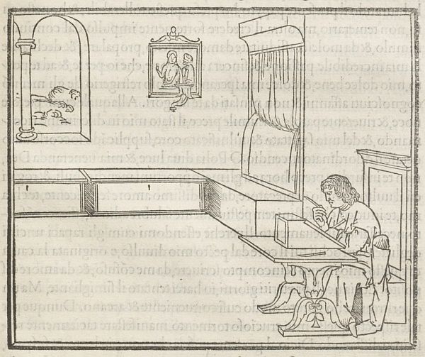
Poliphilo’s eyelids finally close as the sun rises. His memory is tormented by Polia, whom he first glimpsed through a window in Treviso. Her chastity is non-negotiable: in a time of plague, she has sought spiritual purity. Yet Polia’s resistance only makes her suitor more desperate. On May Day, 1467, exhausted and heartbroken, Poliphilo finally gives in to a dream — the only space of requite. With its conjured worlds and strange architectural landscapes, few visions in Western literature have been scrutinized more than the vision Poliphilo had on that morning.
 
We know about this dream thanks to a manuscript that landed in the hands of Leonardo Crasso, a jurist of Verona who saw it fit to make the story public. Hypnerotomachia Poliphili — or, as the book came to be known in English, “Poliphilo’s Strife of Love in a Dream” — was eventually published by the renowned Venetian press of Aldus Manutius in 1499. It was the first fully illustrated book produced by Aldus, a printer whose reputation stemmed from his vast humanist erudition and devotion to classical literature. Structured as a “dream within a dream”, the narrative weaves together mythological, biblical, and occult references to construct a universe filled with ruinous landscapes and orgiastic celebrations. No cost was spared by Crasso; Poliphilo’s dream is visualized across 234 folio-sized pages, which feature nearly two hundred woodcut illustrations of unparalleled mastery for their era. In Redmond Burke’s words, the editio princeps was “the most beautiful incunabulum ever printed”. Yet Hypnerotomachia did not fit comfortably on Aldus’ august shelves. Its licentious content quickly turned into a matter of controversy, stirring speculation on the conditions and purpose of the incunabulum’s production.


On the right, The Worship of Priapus, featuring nineteen women and five men. In the foreground, priestesses sacrifice                    an ass beneath the phallic god’s herma —


            A fountain of the “little Priapus”, featuring a weight-sensitive step that, when depressed, “raises the child’s instrument”,             spraying Poliphilo’s face with cold water


For all that we know, the original “dreamer” remains unidentified. Written in an idiosyncratic hybrid language fusing Italian, Latin, and Greek, and replete with inauthentic Egyptian hieroglyphs and an abundance of architectural and botanical jargon, the rambling text of Hypnerotomachia does little to dispel the mystery of its authorship, even though it does mirror with remarkable accuracy the composite, winding nature of its contents. An acrostic formed by the first letter of each chapter, reading “Poliam Frater Franciscus Columna Peramavit" (Brother Francesco Colonna greatly loved Polia) led scholars to identify a Dominican monk from Treviso as the author of the book. Nevertheless, the polymathy of Poliphilo — along with the cryptic and playful nature of the work as a whole — has raised doubts regarding the plausibility of this hypothesis, with some critics suggesting that “Colonna” could be a pseudonym.
 
Hypnerotomachia has been described as a “tableau of rich inventions”, “a romantic version of an encyclopedia”, and a “treasure house of aesthetic descriptions”. The name “Poliphilo” translates both as “lover of Polia” and as “lover of many”. And it is indeed an erotic curiosity that spills over from his pursuit of Polia, sublimated into an almost amatory infatuation with many forms of architecture. The dream follows Poliphilo’s meandering footsteps as he wrestles with mythical creatures and his own impulses in a series of fantastical worlds. His eyes alight on imagined monuments, statues, and follies. Myriad species of plants, growing silently in these chasmous structures, dissolve into blossoming orchards and forests populated by dragons, nymphs, and carnivorous wolves. From magic lamps to ornate corals, everything is meticulously recounted by Poliphilo, as his insatiable curiosity becomes the primary force that propels him into action, fixing together the disjointed scenes of his journey.


A terrified Poliphilus fleeing from the dragon


A colossal bronze horse upon a pedestal, featuring sculpted genii unable to grip the steed due to its “great speed                          and   hard jolting”


Designed to draw its reader into the seductive delirium of Poliphilo’s odyssey, Hypnerotomachia is perhaps the first secular iteration of an immersive virtual world to be granted a comprehensive and consistent architectural presentation. Throughout the book, the figurative rhetoric of chivalric love is brought into a playful union with the visual conventions of fifteenth-century architectural treatises. Important here is not only the attention given by the author to the architectural staging of a literary dream, but the way in which the dream, in turn, seems to infiltrate and overtake the design of this outlandish scenery.
 
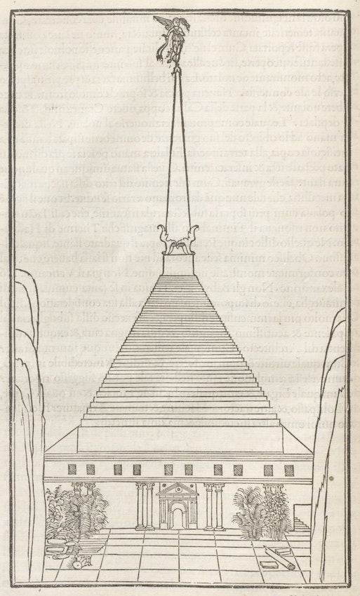
The bewildering shapes of the various structures encountered by Poliphilo along his journey — colossal statues, pyramidal temples, and elaborate fountains, among other edifices — depart radically from the principles of composition found in canonical historiography, calling to mind a number of mythical antiquities that haunted the dreams of architects at the time. For the historian Liane Lefaivre, this association between composite architecture and the recombinant imagination is best illustrated by the Temple of the Sun, a jumble of unrelated parts that are stacked to create a monument of unthinkable dimensions.


The Temple of the Sun, constructed of white Parian marble, with 1410 steps and a                                                                         cornucopia-clutching winged figure


   “Considered vertically, the building is an unlikely compilation of elements. On top of the temple is a plinth, and on top of the plinth is a pyramid, and on top of the pyramid is a monolithic stone cube and on top of the monolithic stone cube is an obelisk and on top of the obelisk is a bronze statue of a nymph holding an inverted cornucopia. Poised on one leg with the other elevated in arabesque, she pirouettes on a pivot with every shift of the wind, emitting a deafening shriek with every turn. “”
 
Hypnerotomachia abounds with similar piles ranging in size from massive to miniscule. See, for example, how the principle of the obsessive piling in the “Temple of the Sun” is repeated in the idiosyncratic formulation of the “admirable Coral Bush” and the “Perpetual Fountain”; two among the countless “miraculous” objects encountered and assiduously described by Poliphilo in his narrative. Organic and inorganic elements are here arranged vertically without any discrimination in terms of their materials, shape, or strength, producing ornamental ensembles of obscure aspiration. It is interesting to note, however, that in the Aldine edition of Hypnerotomachia, woodcuts flatten the voluminous splendor of these objects into linear compositions. The result conveys a paradoxical feeling of surface and depth that not only matches the symbolic nature of dreaming, but also the various undecipherable inscriptions and pseudo-hieroglyphs that the protagonist discovers along his journey.


Left: an ornate vessel decorated with “marvelous artificial foliage, such as is not made in our times” and surmounted by a cubit-high coral tree, which is nested in a hillock “studded with incomparable gems”. Right: a perpetual fountain with harpies, scintillating emerald leaves, and a golden pomegranate tree with coral flowers containing “calyxes full of golden bees”


                An ivory sarcophagus, containing two perfectly preserved corpses, decorated with so-called Egyptian hieroglyphs. Poliphilo interprets the sequence of emblems as follows: “To the blessed shades. Death spurns all life’s contrary and rapid things. It gives, it takes, it consumes, it dissolves. Here it has sweetly united two dead ones who loved mutually, strictly, and ardently.” 


The origins and meaning of these runes have been traced in the contours of ancient and modern dream theories, from Artemidorus’ Oneirocritica all the way to the Freudian Dream-work, where repressed drives are organized by the unconscious into condensed, encrypted representations able to evade the censorship of waking reason. Extending this premise, critics see the monuments encountered by Poliphilo as the agonizing embodiments of his elusive beloved — or, architectural ideal. Yet it is perilous to assume a direct affinity between form and cognition. In the case of Hypnerotomachia, this would reduce architecture and dreams to their faint, distorted replicas: the dream, in the words of Michel Foucault, to “a mere rhapsody of images”, and architecture to a decontextualized play of forms.


Poliphilo surrounded by remains of classical antiquity. A ferocious wolf eyes him with its jaws agape

 
 Hypneromachia’s illustrations of architectural and ornamental objects appeared during the period when printing presses were replacing the handcraft aesthetic of illuminated manuscripts. An unprecedented exactitude of images, achieved by innovations in printing techniques during the second half of the fifteenth century, brought forth a new visual culture in which knowledge could be recorded and transmitted in a format that remained identical from copy to copy.10 Through the skillful orchestration of type, text, and image, Poliphilo’s dreamworld expands and contracts continuously, pulsating between the fragile solidity of architectural stereography and the planar mechanics of the printing press.
 
Although in most cases the woodcut technology’s abstraction is able to delineate the features of these admirable structures, in other cases, such as that of the Temple of Venus Physizoa, the descriptive texture in Poliphilo’s ekphrastic frenzy far exceeds the representational refinement of wooden block reliefs:
 
“The huge dome displayed the greatest evidence of workmanship more nearly divine than human; but if it were human, it aroused astonishment that human ingenuity should make such an ambitious attempt in the founder's craft: for I judged that its great vastness had been made in a single solid fusion and casting of metal. I was astonished and overwhelmed by what I deemed to be impossible. Be that as it may, this bronze work consisted wholly of a vine sprouting from beautiful vases of the same material that were ranged perpendicularly above the columns. Thence they spread out branches, sprouts or shoots, and tendrils of dizzying intricacy, perfectly fitting the convex curve of the dome and all of the appropriate thickness. There were leaves, bunches of grapes, infants climbing and plucking them, flying birds, lizards and snakes, all modelled exactly from nature; and in between it was all transparent.””
 
Poliphilo’s description unfolds through a marvelous enhancement of his perceptual abilities. As his (inner and outer) vision sharpens, the interior of the temple dissolves into an infinite array of details, organized in continuously magnified pictorial scenes. Despite its virtuosity — and impressive awareness of contemporary artistic conventions — the orthogonal section of the Temple of Venus fails to convey the edifice’s complexity. A complexity that seems to transcend not only the limits of representation, but also those of human comprehension.


Section and ground-plan of the Temple of Venus Physizoa, whose spire is capped by a bronze crescent                                         moon and an eagle with its wings akimbo


In the centuries that followed its enigmatic appearance, Hypnerotomachia came to represent a type of architectural and artistic invention that derives its sensuous, eccentric qualities from the cryptic world of dreams, rather than from the orderly forms usually associated with Renaissance aesthetics. Yet, besides its multiple references to and deviations from architectural rules, the world in which Hypnerotomachia unfolds presents astounding continuities with the broader religious, civic, and cultural context of Venice at the time. The ruination of the world in which Poliphilo wanders coexists with the marvelous monuments he encounters in a way that is reminiscent of the double function of Christian icons in this period. For Hans Belting, the icon’s intentional fragmentation of pictorial space pointed to a transcendental world that remained intact. Accordingly, the kind of memory that these artworks heralded had “both a retrospective and, curious as it sounds, a prospective character”. The icon was not only a trace of something from the past but also something that was promised in the future. A similar dynamic is at play in Hypnerotomachia, against the backdrop of the Venetian art scene and the work of Vittore Carpaccio in particular.
 
Investigating the various strategies mobilized by fifteenth-century Venetian artists to represent the past, Patricia Fortini Brown observes the imaginative re-creation of a sensuous Arcadian antiquity in works like Hypnerotomachia. This was not merely an echo of the paradisiacal travel reports from the Aegean islands to which Venice had privileged maritime access. It also reflected a peculiar quality shared by architectural and religious drawings at the time, namely the simultaneous invocation of multiple temporalities.


Vittore Carpaccio, Dead Christ, ca. 1520


Detail from Vittore Carpaccio, Dead Christ, ca. 1520


In Carpaccio’s Dead Christ (ca. 1520), for example, a landscape reminiscent of Hypnerotomachia unfolds around the body of the slain savior. Almost Byzantine in its execution, the scenery is rocky and desolate, with opened graves, skulls, broken tombstones, columns and slabs: fragments of what would have been seen as pagan ruins. In the background of the image, however, appear two figures in Quattrocento attire and pastoral attitude, happily playing musical instruments. Like Poliphilo and Polia, these figures function as “time travelers”, contemporizing antiquity for the beholder, while intruding into a past that will be forever unattainable. In the pages of the Renaissance architectural treatise, the “downward movement of imitation”, bringing the present back into the past, and the “upward motion of invention”, in which the past serves as a model for the future, are also merged in a similar “chiasm”, argues Anne-Marie Sankovitch. The latter creates uncanny structures built on the logic of dreams — like images drawn from one's memories to project a yet-to-be-realized reality.


Poliphilo looking through a bower at Polia, who approaches from a distance. “She had such a presence and charming elegance that perhaps even amorous Idalia did not appear thus to warlike Mars, nor the handsome shepherd Adonis to her, nor the delicate Ganymede to almighty and inflamed Jupiter, nor beautiful Psyche to ardent Cupid”


                        From left to right: a weathercock, with genius blowing the trumpet; a box tree pruned into the shape of a man, whose feet rest on vases, and arms support an ornament of towers and arch; another box tree, this one pruned in the shape of a centrepiece; and the decorative crowning of the Temple of the Sun


Under the guise of the dream, Hypnerotomachia seems to present a new symbolic universe in which the complicated relationship between ancient and modern space could be redefined. In his influential book, Unearthing the Past, Leonard Barkan showed how the pace at which antiquities were being unearthed in the late Quattrocento brought forth a sea change in historical, political, and aesthetic thought. These resurfaced objects didn’t just challenge established views on the past. They also generated new kinds of artistic expression and appreciation, including the production and circulation of drawings and ekphrastic narratives, the first private collections of antique fragments, and new forms of theory and practice that embraced architecture’s inventive as well as restorative potential.
 
Yet Hypnerotomachia is much more than an architectural manifesto. These intricate negotiations also seem to emerge through the orchestration of Poliphilo’s and Polia’s triste. Almost halfway through his dream, Poliphilo encounters the beloved and embarks with her on a journey to celebrate their union. The dreamworld appears to have diminished Polia’s resistance; receptive to Poliphilo’s advances, the woman sets off to explain her former hesitations and recent change of mind.


A sequence from Polia’s narrative: “a furious goddess crowned with a wreath of agnus castus, with an unstrung bow and empty quiver, who turned a frightful countenance on me, burning with the desire to wreak cruel vengeance”


By honoring the vow she took during the plague that ravaged her hometown, Polia dutifully safeguarded her emotional and bodily boundaries against a courtship that she saw as a risk to her life. “No sooner did I see him before me”, she describes of a meeting with Poliphilo, “than I felt polluted [contaminata]”. Hiding alternatingly in the shrine of Diana’s temple and in the privacy of her bedchamber, Polia almost succeeds in avoiding her suitor’s pursuit. It is only after experiencing a revelatory vision of her own that she begins to doubt her resistance. She dreams about a graphic, supernatural violation of body and soul — a Cupid-like winged boy playing the dismembering executioner — representing the societal violence that awaits should she continue to reject the company of a male companion. Rarely acknowledged by scholarship, the author’s decision to give Polia a voice and dream of her own remains one of the most daring propositions of the book.


Polia witnesses maidens “whipped incessantly by a winged youngster” who then murders them with an iron sword “without the slightest indulgence or pity”


Much like Nausicaa’s visitation by the goddess Athena in the opening of the Odyssey’s sixth rhapsody, Polia’s vision at the closing of Hypnerotomachia reaffirms the primacy of a patriarchal, civic order over the sovereignty of a female body. Unlike Nausicaa, however, who was chastised for the messiness hidden behind the ornate doors of her bedroom, Polia is forced to give up idealistic purity and embrace the disturbing disorder of Poliphilo’s world. This reversal becomes all the more pronounced considering how the tactility of Nausicaa’s messy trousseau gives way to fully fledged architectural pandemonium in Hypnerotomachia.
 
As the protagonist digresses in the warped space-time of dreaming, Polia’s narrative comes to fold the creative potential of Poliphilo’s imagination back to the source of its departure: a mundane room in fifteenth-century Treviso. And when Poliphilo finally awakens, he is alone. Polia has vanished, along with the architectural fantasies that populated his dream. Her ultimate disappearance signals the most radical gesture in a book that wrestles with the enigma of its own creation.


Poliphilus alone, writing to his beloved Polia


Hypnerotomachia Poliphili and the Architecture of Dreams. By Demetra Vogiatzaki. The Public Domain Review, September 28, 2022.


“Reader, if you wish to hear briefly what is contained in this work, know that Poliphilo tells that he saw remarkable things in a dream, hence he calls the work in Greek words ‘the strife of love in a dream’. He represents himself as having seen many ancient things worthy of memory, and everything that he says he has seen, he describes point by point in the appropriate terms and in an elegant style: pyramids, obelisks, huge ruins of buildings.” With these words, Francesco Colonna introduces his Hypnerotomachia Poliphili in 1499, at the closing of the age of the incunabulum. A Dominican friar living in Venice, he waited for thirty years before his manuscript, completed in 1467, was published by Aldus Manutius. This was partially due to the cost of the undertaking, for the volume, together with its 174 woodcuts by an anonymous artist, was one of the most extravagant publishing ventures of its day. English readers have had to wait a lot longer, until this 1999 edition that appears exactly 500 years after the entry of Hypnerotomachia Poliphili into the Renaissance literary canon.
 
Often mentioned as one of the most handsomely produced books in the Renaissance, the first edition of Hypnerotomachia Poliphili is exceedingly rare. Many surviving copies have been mutilated by readers wishing to possess some of its opulently designed woodcuts. It is, therefore, all the more rewarding that the present publication attempts to convey the beauty of the original by adhering to its size, as well as to the layout of the text and the images. Adding to the appeal of this English edition for bibliophiles is its typeface, favored by Aldus Manutius and known by modern printers as “Poliphilus.”
 
Indispensable to any study of the Renaissance obsession with the lost world of Antiquity, Hypnerotomachia Poliphili is more admired than actually read. Part of the reason for this is the notorious difficulty of the original language, a fanciful linguistic idiom based on Latin vocabulary and Italian morphology and syntax, challenging even for Colonna’s contemporaries. A labor of love for Joscelyn Godwin, this translation follows his earlier forays in the intellectual history of the early modern world, most notably his publications on the seventeenth-century philosophers Robert Fludd and Athanasius Kircher.
 
The story—ostensibly a retelling of a long and involved dream that takes Poliphilo through a landscape filled with ruins, tablets with inscriptions and hieroglyphs, and other magnificent or curious remnants of Antiquity—is both autobiographical and allegorical. Like Dante and his Beatrice, or Petrarch and his Laura, Poliphilo pursues an ideal lover, a nymph by the name of Polia. And, like these illustrious examples, he is doomed to lose her at the moment of their closest embrace, as her body disappears into the air, ending both his dream and his book. While the exact meaning of this symbolic account is as elusive as Poliphilo’s pursuit, the author hints at his allegorical intent throughout, beginning with the names of the two main protagonists. That Poliphilo (literally “the lover of Polia”) is his alter-ego, is suggested by the closing words of the nymph in which she calls him a “column of her life” (Italian “Colonna”). Polia’s own name, deriving from the Greek term for “old age” or "antiquity, " is generally understood as a hermeneutical key to the overall theme of this dream-book.
 
Like its language, the literary genre of Hypnerotomachia Poliphili is truly a hybrid one, combining the conventions of romance, travelogue, and antiquarian treatise in an ever-changing narrative. To follow Poliphilo’s descriptions of the temples and monuments encountered on his imagined journey is to delve into an assemblage of favorite Renaissance topoi. At the same time, this learned fabric is interwoven with passages detailing his desire for Polia, whose undisguised eroticism brings to mind the popular contemporary literature of a more lascivious bent. In this manner, as stressed in the dedicatory preface to the 1499 edition, he fashioned a book for many audiences, a cornucopia of knowledge that could rival the work of the ancients, and be presented with a pleasing grace and novelty.
 
Notwithstanding its textual eccentricity, Hypnerotomachia Poliphili has had a rich pictorial and literary legacy. Mantegna, Titian, Lotto and Bernini, to name but a few of the artists it inspired, eagerly drew upon its opulent, often enigmatic imagery. Equally important was the impact of this volume on emblem books, the principal vehicle for the dissemination of visual and poetic tropes in the seventeenth century. From Alciatus and Valeriano, to lesser known authors such as the Antwerp poet Jan van der Noot, Hypnerotomachia Poliphili was a favorite sourcebook of Renaissance commonplaces.
 
Though its publishing history prior to 1999 includes a number of translations, most of them are abbreviated versions of the original. Notable among them, at least in terms of the wider circulation of the text in Europe in the century following its writing, was the 1546 French edition: Hypnerotomachia, ou, Discours du Songe de Poliphile. The first and only attempt to translate this work into English before Godwin was made in 1592, as Hypnerotomachia The Strife of Love in a Dreame (London, Simon Waterson). Thwarted by the scope of the undertaking, the translator R.D. (usually identified as Sir Robert Dallington, a courtier and man of letters), stopped about two fifths into the text, leaving the English readers for the next few centuries with a little more than a foretaste of Colonna’s fertile imagination.
 
In the brief and excellent introduction to the present edition, Godwin notes that his translation project would have been a lot more difficult without the critical edition of Hypnerotomachia Poliphili by Giovanni Pozzi and Lucia A. Ciapponi (Padua: Editrice Antenore, 1968, reprinted in 1980 with a new Preface and Bibliography). Unlike that scholarly volume, he intended this translation for a more general audience interested in the culture of the Renaissance. As he observes further, while he tried to preserve the spirit of Colonna’s literary style, he knew that by rendering it in plain, standard English, he would inevitably lose some of its linguistic wit.
 
Notwithstanding this recognition of the limits of any translation, Godwin proves himself a skillful interpreter of Colonna’s eccentric language. Thus, when Poliphilo ventures to describe the physical charms of Polia, his words resonate with the Renaissance poetics of praise of beautiful women, sensitively captured in Godwin’s translation. Polia’s tresses are “filaments of gold with a changeable lustre” ( subtilissimi fili d’oro inconstantemente rutilanti), her “festive and radiant eyesπ are fit to turn Jupiter into a rain of gold” (festevoli et radiosi ochii, da fundere Iove in piogia d’oro), while her cheeks, “fresh roses gathered at dawn and placed in vases of purest Cypriot crystal” (fresche rose alla surgente aurora collecte, et dopoi tra vasi di mundissimo crystalo de Cypri) (145).
 
This rhetoric of desire is even more pronounced in the author’s accounts of ancient ruins, each one a document of the continuous struggle between Culture and the implacable forces of Nature. Standing at a “great ruin of walls and enclosures” (vastitate magna di muri o vero parieti) Poliphilo observes fissures filled with “salt-loving littoral cock’s crestπsaltwort and fragrant sea-wormwoodπ” (alcuni lochi vidi il literale cachile et molto kali et lo odoroso abscynthio marino) (236). At another such edifice, he marvels at “the fragments of holy antiquity” (gli fragmenti dilla sancta antiquitate) and wonders what their effects would be “were they whole” (quanto farebbe la sua integritate) (59).
 
To render Hypnerotomachia Poliphili in an English version approximating the hermetic density of the language of the original would have required philological acrobatics of doubtful merit for readers. Godwin illustrates this point by comparing two passages, the first of which is a “more faithful” translation of Colonna’s description of a Fury: “In this horrid and cuspidinous littoral and most miserable site of the algent and fetorific lake stood saevious Tisiphone, efferal and cruel with her viperine capillament, her meschine and miserable soul, implacably furibund.” As we turn to the “plain” English of the actual translation, we find a welcome respite whose deviance from the original is more a blessing than a loss: “On this horrid and sharp-stoned shore, in this miserable region of the icy and foetid lake, stood fell Tisiphone, wild and cruel with her vipered locks and implacably angry” (249).
 
Godwin may have sacrificed some of Colonna’s linguistic craftsmanship, but he has certainly shown a great sensitivity towards Colonna’s imagination and mastery of tropes. In page after page of this expansive and convoluted dreamscape, he succeeds in imparting the poetic exuberance of the original to the modern reader. Even if Godwin intended this translation for a number of different readers, it will undoubtedly rekindle the interest of art historians in this famous, if still insufficiently explored monument to the Renaissance infatuation with Antiquity.
 
Hypnerotomachia Poliphili: The Strife of Love in a Dream. By Aneta Georgievska-Shine. CCA.Reviews, June 16, 2000.


The Project Gutenberg EBook of Hypnerotomachia, by Francesco Colonna. Translated by  Robert Dallington, 1969.