Masterpiece
for masterpiece, the Frick is the best small museum in the United States for
western painting before 1900. The institution reopens today in the Whitney
Museum’s former flagship on Madison Avenue, where its art will be on view for
the next two years while its own building is being renovated. On hand is enough
great work to keep you absorbed for a lifetime, including four Piero della
Francescas; three Vermeers; two Turners; and works by Goya, Tintoretto, Duccio,
Constable, El Greco, Ingres, Titian, Tiepolo, Chardin, Watteau, Boucher,
Memling, Manet, and Veronese (who used bodies of female insects, Hungarian
copper carbonate, and resinous bug secretions to amp up his voluptuous color),
as well as two of the most philosophical paintings in this country, Rembrandt’s
late self-portrait and Velazquez’s Phillip II. We stand agog before the
hallucinogenic majesty of these pictures as one would gawking at the desert on
mescaline.
Yet,
amid these riches, there is, I am embarrassed to admit, one series of paintings
in particular that stands out from the others for me, and it’s Jean-Honoré
Fragonard’s The Progress of Love (1771–73). It’s embarrassing because Fragonard
is the chief representative of (some would say culprit in) the most reviled
period in all of art history: the Rococo.
The
period may be said to have commenced on September 1, 1715, the day that
France’s “Sun King,” Louis XIV, died. It was like a social iceberg melted:
Overnight, stultifying court etiquette and social hierarchies began loosening.
The style ceased to exist on July 14, 1789, as crowds stormed the Bastille and
the French Revolution began: a definitive ending, an art-historical extinction
event. In the years between, Rococo imparted something to western painting that
had never quite been there before: the unbearable lightness and gladdening
mercy of being alive, expressed in loose brushwork at small and medium scale —
for the enjoyment of private owners. This wasn’t an art of kings, queens, and
the church triumphant. It was first and last meant for pleasure, decoration,
celebration, and love. People associate the spectral sweetness, ribbony
linearity, and arabesque tapioca-like touch of the Rococo with pictures of
walking orchids with nothing on their minds but sex and love. Indeed, some of
the naughtiest paintings of the last 300 years are Rococo. But the period also
probed the deepest nuances of life and gave us, in addition to Fragonard, five
other full-fledged geniuses: Watteau, Goya, Boucher, Chardin, and Mozart.
In 1767,
four years before starting Progress of Love, Fragonard became famous after
creating the most celebrated painting of the era, usually known in English as
The Swing. You know this painting even if you don’t know you know it. A young
woman in a coral-colored dress swings on a velvet seat in a park. We see her at
the apex of her arc, as her slipper flies off and the wind blows up her skirt
and petticoats; her stockings, even a little thigh, are flashing into view. She
looks down, toward a stunned young man on the ground who is gazing upward,
shocked, falling over. We don’t know if he’s her husband, a lover, a stranger.
He raises one hand in surprise or hosanna and with his other holds his hat up
toward her. His pose echoes the naked Adam in Michelangelo’s Sistine Chapel —
in a fun pas de deux of flirtation. When this private picture was exhibited,
Fragonard’s depiction of pleasure, exhibitionism, voyeurism, play, and the
ritualized ways people have fun with and touch one another in public made him a
star.
The
Swing is not in the Frick collection. But that doesn’t matter, because all five
of the paintings (and all the attendant panels) of The Progress of Love are
just as visionary and exquisite — and at the largest scale on which he ever
worked. (They’re also about the largest paintings in the museum.) We get a
simmering vision of love drenched in aesthetic dopamine. There are pinks,
powder blues, blooming fruit trees, bouquets of flowers. The cycle of paintings
not only tells a tale of love; it embodies an entire era of art history. It
also signals its waning and the coming conflagration of the French Revolution,
the collapse of the ancien régime. It’s a last gasp, an encyclopedia of amour
in a soon-to-be-purged world on the verge of destruction.
The
paintings were commissioned by the last royal mistress of Louis XV, the
Comtesse du Barry, to cover each of the walls of her new dining pavilion just
outside Paris. When Fragonard showed the first four works to the comtesse,
however, she rejected them as passé. Instead, she commissioned the insipid
faux-antique paintings of Joseph-Marie Vien, images of sappy Greek maidens with
no skeletons standing about gardens, crowning one another and offering each
other odd garlands. Fragonard packed up his paintings and left. Later, he completed
a fifth painting in the south of France.
What’s
so fantastic about seeing these paintings at the Frick Breuer is not only how
close you can get to the work, now that it’s not surrounded with furniture and
bric-a-brac. In the mansion, the Fragonards are installed — even swaddled and
segregated — in a wonderful Rococo drawing room, with attendant panels over
doors and next to windows. Here, the work is given pride of place on the fourth
floor next to the gigantic trapezoidal window looking out over Madison Avenue.
Up close and at eye level, the work is reborn as these huge heraldic thunderous
paintings, visually vehement and emotionally commanding. I love them more than
I ever have.
The
original four pictures show narratives of flirtation, courtship, clandestine
meeting, quixotic love, adventurousness, allure gone right and wrong. The order
of the narrative is unknown; all the titles, including the one for the series,
were added later. Consider “The Pursuit” chapter one. Three young girls in
billowy dresses lounge like little bored Venuses in a park. They are surprised
by a young man who appears on the left with hat in hand, extending a rose to
the central girl. It’s sweet and sappy; the girls react in a combination of
faux alarm, tittering glee, and disinterest. The central girl, however, has
jolted upright. She extends both arms out and tippy-toes on her slipper. Feel
the jolt, a fish biting the line of first amorous interest. She looks directly
at the rose. She seems game, unafraid. (I see him as already out of his league
— or maybe that’s me projecting.)
Next
comes “The Meeting.” Beneath a voluptuous Venus statue, our heroine is alone on
a terrace. On the right side of the painting is a young man. He’s just gotten
to the top of a ladder and is about to hop over the balustrade to join his
amour. But she’s raising her hand to stop him, looking in the opposite
direction. He freezes. While she may just be making sure the coast is clear, I
also fancy that she just said good-bye to another suitor. Whatever the story,
she’s running this show.

The next
painting is “The Lover Crowned.” Something feels amiss here; irony and
self-consciousness have entered the picture. In this canvas, the young woman’s
attention isn’t riveted anymore on her young man — she’s posing as they are
sketched by a nearby artist in a garden. Musical instruments are strewn about.
She holds a garland of flowers over his head as he moons at her from below.
Their emotional tenors are so different, though. She’s warm but not ardent; her
passion is under wraps. He seems clueless. For me, this is love divided; a
conflicted sexual dynamic or duplicity that threatens to break spells and cause
pain has entered the picture. These couples and characters might perish outside
this cloistered world.

Chapter
4 is “Love Letters.” Our couple is in a woodland clearing. There’s an ominous
heart-shaped opening in the canopy of leaves behind them. Throughout these
paintings, you come to realize that the gigantic surrounding landscapes have
been closing in and may have always been the main feature. I see haze on the
horizon, a waning cooler light. The woman reads what could be a love letter or
a poem — maybe from her beau, who is again draped all over her. While she’s
amused, he’s a puppet in love. A King Charles spaniel at their feet looks out
at you like it knows something is off. A putto statue seems alarmed above them.
The girl is blushing but still not especially involved. You suddenly realize
we’ve never even seen these two truly embrace.
Around
the time that the comtesse rejected these works, the roof fell in on Fragonard
more generally. By 1778, Rococo was becoming discredited. There were new,
pre-Revolutionary allegiances in art to Greek and Roman ideals. Rococo was seen
as decadent, anti-Revolutionary. If art wasn’t for the greater good, it wasn’t
seen as good at all. It was a time when government restrictions on freedoms
were ratcheting up in western Europe; monarchs and ministers watched the
American Revolution with apprehension. Secession movements multiplied
throughout Europe. As unrest in France began to boil over, the king and censors
cracked down, and the press was curtailed. The state reasserted its powers.
Rococo was doomed. Fragonard died in 1806, forgotten and shunned.
He
finished one last major project before that. In 1791, he completed The Progress
of Love, adding a fifth major panel titled “Reverie.” It should be called
“Breakdown” or “The End of a World.” This work is hung in a separate gallery at
the Breuer — with ten other panels completed at the same time. Now we find the
female protagonist in a psychic environment we have never seen before. She’s
deserted, ghostly, spent, forsaken, collapsed. I see a grand era coming to a
close, the fates moving in, destinies beckoning: It’s a new world where people
no longer die among friends and family but among strangers, alone.
Here,
Fragonard finally looks outside his lifelong palm grove of pleasure to what
would eclipse and kill it. The painter had always avoided the dangerous
intimacies and true vulnerabilities of love, even as he depicted romance. But
his world had always been under pressure. The landscape was always closing in.
Only Fragonard’s extraordinary touch, lustrous color, and frivolous version of
love without shadows kept the wolf of reality at bay.
The
Frick on Madison Finally Lets You See Fragonard Up Close Empowered by its new
setting, work once considered frivolous becomes visual thunder. By Jerry Saltz. Vulture,
March 18, 2021

“I would
paint with my ass,” quoth Jean-Honoré Fragonard (1732–1806), the 18th-century
French artist best known for his idyllic, carefree, private, sometimes even a
bit risqué, scenes of life under the ancien régime. Happily, for that world and
for posterity, a more idiomatic translation of Fragonard’s dictum merely meant
that he would paint “all the time” or “as much as he could.” And, indeed, he
did. In his active years, which the French Revolution brought to a swift halt,
he produced some 550 paintings, accompanied by a corpus of drawings so large
and revelatory that a penchant for collecting drawings arguably began with him
and has acquired a popularity matched only by a small number of other painters.
The first cataloger of Fragonard’s works declared his drawings to be his true
“triumph.” In 2016–’17, the Metropolitan Museum of Art mounted a major
exhibition of his drawings alone.
Prolific
though he was, Fragonard’s life remains obscure. He left no memoirs or diaries,
and no letters of significance. Most descriptions of him, though far from
definitive, reveal a taciturn, secretive, often morose man who stood just under
five feet and was known to be disputatious and vindictive. Two rich patrons who
engaged Fragonard as a traveling companion for artistic journeys made hardly
any reference to him, suggesting that they could not pin down his personality
and preferred to forget his company. He dodged celebrity, abandoning the path
open to him as a well-trained, official “peintre du roi” in favor of exploring
his own inclinations through private commissions. Only five of his paintings
are dated.
Even
Fragonard’s most sympathetic contemporaries despaired of what they saw as his
“self-defeating modesty.” In his old age, when his portrayals of the delights
of aristocratic private life clashed with the relentlessly public demands of revolutionary
ferment, Fragonard slipped into obscurity and mainly drew for himself,
retouched existing works, and collaborated in lesser paintings with his wife
Marie-Anne, his son Alexandre-Évariste, and his pupil and sister-in-law
Marguerite Gérard, all well-regarded artists in their own right. As his
grandson Théophile, also an accomplished painter, wrote after his death, “he
outlived his public by some twenty-five years.” Fragonard’s posthumous renown
only came decades later, when the famous Goncourt brothers rediscovered him.
The stylizations of his brushwork, which favored motion over representation,
subsequently found their way into impressionist painting; Berthe Morisot was
reputedly his great-great-niece, though the relationship is uncertain. Fragonard’s
standing in the international artistic firmament was cemented by the
industrialist Henry Clay Frick’s purchase for his Manhattan home — now the
Frick Collection — of the four-panel series The Progress of Love, which Louis
XV’s mistress Madame du Barry had rejected, presumably as old-fashioned, after
Fragonard had completed it on commission for her.
Despite
the cynicism of our increasingly irrelevant art academicians, who tend to view
Fragonard’s popularity as suspect in a world that demands relentless social
purpose in creativity, enduring Romantic sensibilities have only increased
Fragonard’s value and renown. In January 2021 (to cite only the most recent
example), Christie’s sold 14 of his drawings, with most going above the
estimated price even as galleries are taking a beating in the pandemic economy.
The highest valued among them realized a double estimate, at $1.1 million.
With
only barebones biographical details, writing a definitive scholarly biography
of Fragonard is a challenge. In Fragonard: Painting Out of Time, Satish Padiyar
of London’s Courtauld Institute, who has previous written on Fragonard’s
contemporaries Jacques-Louis David and Antonio Canova, prefers to pursue what
he calls the “Fragonard effect,” a thematic exploration of his life and works
unmoored from linear biographical narrative. For reasons that elude me, this
approach is becoming popular in biographies of less documentable subjects, but
it really only conveys impressions or themes from a life rather than a studied
appreciation.
The main
themes Padiyar favors, in chapter-length treatments, are “secrets,” “surprise,”
and “dreams.” By “secrets,” the author means the unknown or unverifiable
details of Fragonard’s life, though many of these have been at least deduced
elsewhere, as well as the “secrets” of private life as revealed in his works,
which clashed with the public-oriented “common good” Enlightenment
sensibilities adopted by so many of his peers. After producing his landmark
Coresus Sacrificing Himself to Save Callirhoe (1765), Fragonard never again
attempted a sprawling historical painting, instead preferring what his
detractors termed “the small” (“le petit”). This included “small” people,
especially children of prosperous parentage in portraits or domestic scenes
that impart a powerful sense of personal autonomy. I have one of these
portraits in my own collection, of a rosy-cheeked boy who bears a confident
countenance that young people are no longer supposed to display. The larger A
Boy as Pierrot (ca. 1776–1780), now in London’s Wallace Collection, is a more
accessible example.
The
“petit” category also encompassed the “small” work of fulfilling private
commissions, many of which remain obscure in origin and inspiration. One of
Fragonard’s most vibrant works, a 16-painting collection of individuals in
flowing Spanish dress engaged in leisure or creative activities known as
Fantasy Portraits (ca. 1769), was so “secret” that we still do not know why
Fragonard painted them. The subjects’ identities largely remained a mystery
until an annotated drawing by the artist, which named almost all of them,
emerged in 2012. Long scattered among different owners, they were not even
widely recognized as a composite work until the 1960s and have only been
displayed together twice since then, most recently at Washington’s National
Gallery in 2017.
As
radical applications of “reason” fought for hegemony over French public life,
critics resented Fragonard’s purportedly dangerous indulgence in the personal
and private spheres. For them, these realms of undisciplined feeling fostered
loyalty to family over society, to love over duty, to pleasure over reason. In
their priggish view, Fragonard was all the worse since his commissions by their
very nature meant that his creations would be limited to private contemplation
and concealed from public view. That they were also lucrative (Fragonard’s
late-life poverty seems to have resulted from bad investments and the financial
chaos of revolutionary France) probably did not soften their antagonism.
Infamously reviewing his cherubic A Group of Children in the Sky (1767, likely
a study for a rococo ceiling painting), the encyclopedist Denis Diderot derided
Fragonard’s efforts as poorly executed decoration and never again mentioned him
in print. Many of Diderot’s contemporaries agreed that the artist was outmoded
and would have no legacy. By transgressing philosophe sensibilities, Fragonard
was, in effect, “cancelled,” at least in Enlightenment cultural discourse.
We can
only imagine what, if anything, Diderot thought of Fragonard’s iconic The Swing
(or, to give it its original title, Happy Accidents of the Swing [1767]), but
the theme of “surprise” allows Padiyar to offer some of his most original
analysis. The Swing’s fuller title is more instructive here, for it is the
“accidental” exposure of its central figure’s eponymous ride that allows her
young suitor to see what lies underneath her flowing dress as she is propelled
into mid-air.
Fragonard’s
most dynamic works undeniably capture the energy of a dynamic “moment.” The
very best, in Padiyar’s apt description, explore “the visceral and psychic
experience of a sudden loss of balance,” or a “precariousness” to which the
artist was “bizarrely, hyper-sensitively attuned,” like a quick-shutter camera
snapping an action shot in real time. Most evocative were those images that
involved amorous encounters, which The Swing only suggests with attenuated
gestures that recall divinities in the Renaissance masterpieces Fragonard had
studied in Rome.

Elsewhere,
the “surprise” element often suggests ambiguity or doubt. While some of his
works, such as The Oath of Love (ca. 1780), offer genuinely absorbing affection
bathed in warm colors, others, such as The Useless Resistance (ca. 1770–1773)
and the more famous The Bolt (ca. 1778), which Padiyar claims to find
“shocking,” approach the fine line between willing seduction and libertine
ravishment. Padiyar’s moral poses and consequent interpretive license sound
manufactured for a modish purpose that already seems rather dated, but the
academic discipline of art history would probably not have it any other way.
Are the red curtains in The Bolt really suggestive of sexual assault in a
sympathetic anticipation of #MeToo? Probably not. The Goncourts sardonically
noted that its female subject’s “fall is inevitable,” but when The Bolt entered
the Louvre’s collection in 1974, the only public discussion involved questions
about its authenticity. Thirty years later, Annie Leibovitz had no problem
recreating the scene for Vogue, with Gisele Bündchen and Gérard Depardieu
standing in for the figures.
Padiyar’s
“dreams” theme explores another form of the hidden personal life, examining
Fragonard’s frequent depiction of repose and reverie. The author convincingly
argues that these very private actions suggest the personal autonomy and
freedom from time constraints that proved intolerable to the philosophes in
their mad quest for a purposeful existence and demand that their sober values
be reflected in art. Fragonard’s works in this vein are vulnerable to the
tendentious charge that they draw the viewer into a contemplation of lethargy
that threatens to distract from the active life of the homme engagé. The artist
himself may have been his own best subject in documenting this effrontery: in
The Inspiration of the Artist (ca. 1763), he drew a rare self-portrait of his
stout figure reclining before a work table with his hand placed searchingly
over his eyes and forehead as a host of angels flutters around him.
The
Goncourts’ concluding metaphor, in their summation of Fragonard’s oeuvre, was
that his “painting is a dream.” They were prescient, for such scenes remain
popular today: Christie’s recent top-selling Fragonard drawing was his Young
Woman Dozing (c. 1775–1785), which depicts a young lady snoozing in a chair
before a vanity mirror. As Talleyrand memorably said, “He who has not lived in
the eighteenth century before the Revolution does not know the sweetness of
life.” In the 21st century, the discerning among us may again have glimpses of
it.
The
Pleasures of Repose: A New Study of Fragonard. By Paul du Quenoy. Los Angeles Review of Books,
March 14, 2021.


Paintings
like The Swing (1767) will forever cause Jean-Honoré Fragonard to be remembered
as one of the more perverted French painters in history. The rococo masterpiece
that Fragonard custom-made to satisfy the baron who commissioned it portrays a
naughty scene: a woman with mischief in her eyes, in a lacy gown, silk
stockings and a bergère hat, is launched into the air on a velvet-cushioned
swing. She holds on firmly as one of her shoes ejects from the tip of her
dainty foot into the sunlit canopy. A smiling older man, presumably her husband
(perhaps a cuck), stands behind her, dutifully maneuvering the swing. He may or
may not be oblivious to a younger man who lurks in the foreground in an
overgrown patch of rose bushes spying on the swinging woman from precisely the
vantage required to see directly up her billowy dress.
The
painting’s unabridged title is The Happy Accidents of the Swing, but clearly,
neither the garter nor the voyeur is in any way accidental. The wife swings
dangerously, passionately, diagonally, through the depths of the picture,
thrilled—one presumes from her dilated expression—by the dizzying speed,
height, deceit, and exhibitionism. A stone putti holds his finger to his lips,
a couple of cherubs play at a beehive, a tiny dog yaps incessantly. The
well-ordered garden has “gone wild,” as they say. Even the foliage seems
fertile and abundant, as if each leaf is titillated.
But
another kind of Fragonard was recently on view at The National Gallery of Art
in Washington I’m referring to Young Girl Reading, painted only three years
after The Swing, in 1770. This unbelievable painting is accompanied by the 13
other “Fantasy Figures” of this highly-acclaimed series. The show has come and
gone, but surprisingly with little buzz. I guess these paintings aren’t fake
enough to be considered fake news, nor real enough to be considered a reality
check.
While
Fragonard’s canvases were painted rapidly and display a Viagra-enhanced
vitality, the atypical Young Girl Reading is both literally and figuratively a
slow read. By rococo standards, she is a yawn. The female in the painting,
however, is not bored. She is contemplative. Her inward absorption makes for a
sobering window into the mind of an 18th-century adolescent. What message is
being transferred across this gulf of time and place from her reading of a book
to our reading of a work of art?
The
“Fantasy Figures” are painted in fragrant set oils. Each sitter is dressed in a
ridiculous Spanish costume, replete with fake jewels, plumed hats, slashed
puffy shirt sleeves; silk ribbons, rosettes, jazzy feathers, large ruffs, and
oversize rapiers. They all look like they’re going to a Don Quixote-themed
costume party.
But
Fragonard’s cast of posers decked out as 17th-century Spanish gentry are all
(bar the anomalous young girl) caught in the act of being in love with
themselves. So high are they on themselves that it’s certainly an outrage! An
allegory of arrogance! And certainly a fitting analog for today’s greedy
plutocrats. It makes one wonder if Fragonard intended to embarrass his courtly
sitters, exposing their atrocious self-regard. In his compositions, he often
elongates his models’ necks as if he is contemplating their decapitation. Or
perhaps he too is in denial of the rising third estate.
If the
“Fantasy Figures” evoke tanning salons, dyed comb-overs, slipping dentures,
double chins, and neckties that point like red arrows below belt buckles, then
Young Girl Reading belongs to a totally different administration. She no doubt benefits
from a different painterly consciousness administered with surprising restraint
and economy. Perhaps this poised Fragonard is pointing not so much to its own
despot (or dick), but to an enlightened one.
Young
Girl Reading should be the talk of the town! She is mindful and contemplative,
perhaps even a proto-feminist. The painting is anti-rococo. It’s an insult to
the joie de vivre of the ultra-privileged. What comes off in other works from
the time as the painter’s theatrical indifference, or indifferent
theatricality, reads in this painting as deep reflection. All it takes is a
quick glance to see how much she contrasts with the ensemble of cartoony
gallants of the French aristocracy.
And yet,
even with her lack of turbocharged egotism, Fragonard’s coming-of-age Reader,
immersed as she is in literature, may be living her own fantasy, not enabling
that of the painter’s or, for that matter, the patron’s. Her fantasy is to
transform into a new kind of humanized woman. The fact that she has her nose in
a book rather than in the air makes her the perfect cover girl for the
Enlightenment, for the right, regardless of gender, to an education, to
information and ideas.
On one
hand, Young Girl Reading is an allegory for the 18th and 19th centuries’
infatuation with progress: reason, rights, revolution, romanticism, realism.
But the painting also hints at the past, at unobtainable dreams, at a cesspool
of ideologies and antiquated notions of gallantry and romance. The source of
Don Quixote’s delusion, for example, is found in the chivalric romances that
pack his bookshelves.
Aren’t
all of our delusions artworks of the mind? And aren’t such idealized scenarios
smuggled into our brains by the most skillful storytellers? Books scribed by
dreamers may enlighten and enliven us, but they may also corrupt us, pervert us
with unobtainable ambitions and unreasonable emotions.
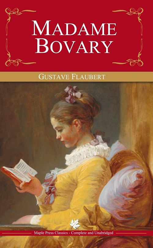
This may
be why, further along in the tradition of the French novel (by the year 1856),
writers like Flaubert had contrived a gallery of rebels like Emma Bovary to
serve both as catalysts and cautionary tales. Madame Bovary was, after all,
perplexed, if not physically pained, by the fact that her mediocre, provincial
doctor husband wasn’t anything like the chivalric men she’d read about in romance
novels. According to Flaubert, back at the convent:
""She on
the sly lent the big girls some novel, that she always carried in the pockets
of her apron, and of which the good lady herself swallowed long chapters in the
intervals of her work. They were all love, lovers, sweethearts, persecuted
ladies fainting in lonely pavilions, postilions killed at every stage, horses
ridden to death on every page, sombre forests, heartaches, vows, sobs, tears
and kisses, little skiffs by moonlight, nightingales in shady groves,
‘gentlemen’ brave as lions, gentle as lambs, virtuous as no one ever was,
always well dressed, and weeping like fountains. For six months, then, Emma, at
15 years of age, made her hands dirty with books from old lending libraries.""
Is
Fragonard’s Young Girl Reading a pre-Flaubertian construction? I wonder as I
admire her perfect profile, as she sits with gray posture on the liminal cusp
of womanhood, in her lemony dress with white cuffs and purple ribbons,
attentive to her page-turner, padded with lilac cushions that could have
arrived that day in a cardboard box marked Amazon Prime.
Static
as most of her body may be, the painting does have a moment of Fragonard twist,
in the delicately animated hand splaying open the pages of her book and holding
it before her thirsty mind like a Penguin paperback.
And her
other hand? It is welded to the chair’s armrest and remains in view. Curator of
European Painting and Sculpture at the Harvard Art Museums, Cassandra Albinson,
has lectured on the significance of this hand, comparing it to Pierre-Antoine
Baudouin’s 1760 gouache Reading, which shows a woman arching back in a chair,
with her breasts out, one limp hand having dropped her erotic book, and the
other having disappeared into the folds of her dress.
But in
Fragonard’s entirely un-pornographic image Young Girl Reading, the young girl’s
body is locked into the composition’s strong horizontal and vertical axes. The
walls and chair provide a sense of compression, even traction. The picture is
boxy, compartmentalized—unprecedentedly Modern.
And
while there’s still plenty of Fragonard in this Fragonard—his schmear—we are
not being forced to look at another of his diagonal X compositions with tilting
torsos and upward chins conveying an obnoxious sense of arrogance.
The
exhibition was organized by one of the National Gallery’s curators, Yuriko
Jackall. But why now? Was she seizing the day to juxtapose Fragonard’s “Fantasy
Figures” with breaking news: the shaming of some and the shamelessness of
others, the daily spin of our white male power mongers? Possibly. But the show
is also timed with and inspired by the recent discovery of an unprecedented
Fragonard drawing known as Sketches of Portraits (c.1769), a drawing that
emerged back in 2012 at a Paris auction and has been doing a number on rococo
scholars for the last five years. This sketch, which was never meant to be
shown but is more like an inventory or stock sheet with rows of thumbnail
sketches and the names of most of the sitters written in Fragonard’s own handwriting!
The sketch has been nothing less than a total art historical mind-fuck proving
that the “Fantasy Figures” in fact, were never fantasies. They were not painted
out of Fragonard’s head but rendered more like quick snapshots of his Facebook
friends.
One
sitter who was previously thought to have been Diderot turns out to be a
relatively average guy, the author and journalist Ange Gabriel Meusnier de
Querlon. We now know that the woman with a dog is a wealthy aristocrat from a
noble Burgundian family, Marie Émilie Coignet de Courson. The man holding a
quill pen is the printer and bookseller Louis François Prault. The
harpsichordist who turns away from her instrument as she fingers a musical
score on a table is a woman known as Mme Brillon. The Actor is Gabriel Auguste
Godefroy, the son of a wealthy Parisian banker, jeweler, and art dealer, and
The Warrior is the miniaturist Peter Adolphe Hall, who owned some 20 works by
Fragonard.
What is
now clear is that Fragonard was networking his ass off at a time when he had
just ditched the academy and was hustling to jump-start his career as a brush
for hire in the wealthy private sector. He had obtained a studio in an artsy
neighborhood and was trying to get the word out that he was available to make
site-specific paintings in people’s mansions like The Progress of Love,
(1771-73), which currently resides in the Frick Collection. But he was also
advertising his prêt-à-paintings if you will—a line of very affordable
one-size-fits-all society portraits that could be painted pretty much on the
spot and sold for just 24 francs.
Fragonard,
in other words, was an entrepreneur, marketing boutique portraits for an
especially vain clientele. And perhaps simultaneously he was positioning
himself, subversively, to provide commentary, like Voltaire, on a society on
the brink of obsolescence.
And yet,
the adolescent is not a vanity piece. To the painting’s credit, and perhaps
purely a fluke, she remains enshrouded in her own authentic inner life,
percolating with ideas. Whether hers is a fantasy of sexual agency or social
conquest, it seems to be ripening at the core, not rotten to the core. Perhaps,
in other words, she is becoming something other than a bird swinging in a cage.
Ironically,
Young Girl’s identity is still unknown. It is possibly Fragonard’s wife,
Marie-Anne Gérard, who was born in 1745, which would have made her 25 years old
when the painting was painted (which also happens to be the same year their
daughter Rosalie Fragonard was born, 1769). Or it is possibly his wife’s sister
Marguerite Gérard, who would have been just 14 in 1770. However, Marguerite
didn’t become a houseguest with the Fragonards for another five years.
Who then
is she? And what is she reading? Both remain a pretty exciting mystery. In the
thumbnail of the Young Girl Reading, we discover a blatant inconsistency. The
girl looks much older and is clearly turning toward the picture plane and
looking out at the viewer rather than appearing in perfect profile absorbed by
her book. It is this intriguing detail that caused Jackall to probe, using
hyperspectral infrared false-color reflectography to basically X-ray the
painting. She and her technicians found that indeed modifications had been made
to the painting.
Connecting
the dots, one hypothesis is that the original client changed her mind (within
30 days I’m sure) and sent the painting back to Fragonard, who, being the
pragmatist that he was, repurposed the canvas, painting on a new head and
plugging it into the original costumed, generic body. This substitution may be
why her neck, in its current configuration, seems a little disproportionately
long, perhaps adding to the feeling of a mind-body disconnect thus lending the
work an aura of cerebral potentiality.
The
Young Girl Reading is unusually composed around a book. And while the pages of
this book only reveal gray horizontal lines imitating the look of text on a
page, we are not shown any actual words, nor does the spine give us an author
or title. We are thus left to guess what she is reading, what is on the mind of
Young Girl thus becoming a matter of projection as well as bibliographic
sleuthing. Maybe she is digesting an old worn copy of Voltaire’s Candide
(1759), a book that had been in print for more than 10 years, a book that would
have been demonstrating that all is not necessarily for the best, in what may
not be the best of all possible worlds. It is also conceivable that Young Girl
is expanding her mind with the epistolary morality tale by Rousseau, Julie,
published in 1761, and the hottest book around for years. Publishers couldn’t
keep it in stock and had even begun renting it out by the day and eventually by
the hour. Readers were so overcome by Julie that high society women began
sending in fan letters to the world’s first rock-star author: “I dare not tell
you the effect it made on me,” one woman writes, “I was past weeping. A sharp
pain convulsed me. My heart was crushed. Julie dying was no longer an unknown
person.”
I see
Young Girl Reading as my own daughter, who is just now entering puberty. I’d
like to think that I approve of whatever she chooses to read and respect
whatever is on her mind.
Female
Agency and Rococo Perversion. By Jeremy Sigler. Tablet , February 2, 2018.
Lecture
– Fragonard’s Young Girl Reading: New Perspectives.
On loan
to the Harvard Art Museums from the National Gallery of Art in Washington,
Jean-Honoré Fragonard’s Young Girl Reading is one of the most famous French
rococo paintings in America. Part of a series known as figures de fantaisie,
this painting has recently been the subject of art historical discovery and
technical analysis.
This
event brought together two scholars working on Fragonard and on the period in
question: Yuriko Jackall, assistant curator of French paintings at the National
Gallery of Art and organizer of an upcoming exhibition on Fragonard (Fall
2017); and Marika T. Knowles, junior fellow in the Harvard Society of Fellows
and a specialist in French art, culture, and literature of the 17th, 18th, and
19th centuries.
Harvard Art Museums, July 29, 2017.